Curriculum Art
At St Michael’s School our curriculum reflects our school vision: Let Your Light Shine. We want all of our children to be excited and motivated throughout their time at our school, and to develop the skills and knowledge to enable them to make the best possible progress in their learning.
We believe that high quality art engages, inspires and challenges pupils to experiment, invent and create. Through our art provision, children will increase their sense of achievement and self confidence to explore creatively in a visual way.
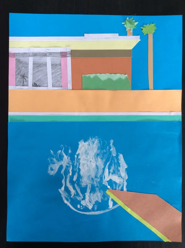
In both the EYFS and Key Stage 1, curriculum art is linked to topics and taught by the class teacher. At Key Stage 2, art is also linked to topics and is taught both in class as well as by Mrs Fraser in the art room. We rotate our skills focus, ensuring that all elements of art are included and a progression of techniques developed. The skills of collage, drawing, painting, printing, textiles, 3D and use of IT are all covered.
Our art curriculum aims to ensure that all pupils:-
- produce creative work, exploring their ideas and recording experiences
- develop control in drawing, painting, sculpture and other art, craft and design techniques
- evaluate and reflect upon our own and others work
- explore great artists, craft makers and designers and understand their place in history and culture.
Intent, Implementation & Impact: Art
Progression of Skills
| Name | Format | ||
|---|---|---|---|
| Files | |||
| St Michaels Art Progression of Skills.docx | .docx | ||
| EYFS 2021 art and music for website.docx | .docx | ||
| PRIMARY_national_curriculum_-_Art_and_design.pdf | |||
Curriculum Overview (whole school): Art
Exciting Art News
St Micheal's World Bot
After appearing in the 'Greatest Dog Show on Earth 2025' our Norbot, designed by Molly in Year 5, is now back at school. Molly's design incorporated the flags of all the countries children at the school have links with. There were quite a lot to include. Can you find any that have a link to you?
Upcoming Events / Competitions
More ways to explore your creativity!
Bristol Museum and Art Gallery Bristol Museums
Half term activities - Children's Scrapstore Free Events — Children's Scrapstore (childrensscrapstore.co.uk)
RWA- free exhibitions to visit What's On | RWA Bristol
Arnolfini Free family workshops Workshops - Arnolfin
GoSketch offers free online art sessions (see link below)
Exciting Art News
Exhibited In London at the Royal Academy of Art
Four of our children had their art work displayed in an exhibition at The Royal Academy of Art in London as part of the Young Artists Summer Show. One of them is now on sale as a print and another has been made into a greeting card. We are all incredibly proud of you and of all the other artists whose work was entered.
Curriculum Art - Our Projects
Year 3
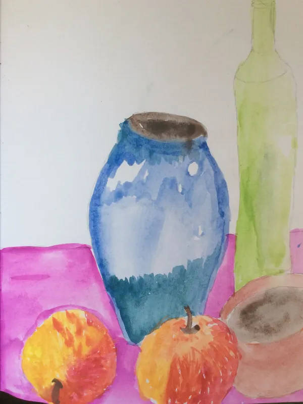
Year 3: Still Life and Artists Study - Paul Cezanne
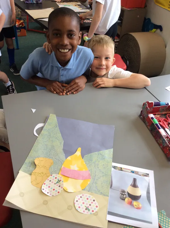
During this term we immersed ourselves in the work of Paul Cezanne and in particular his love of colour, shape, still life and apples!
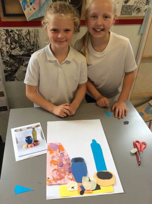
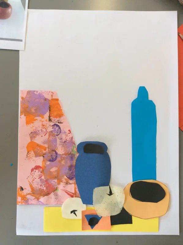
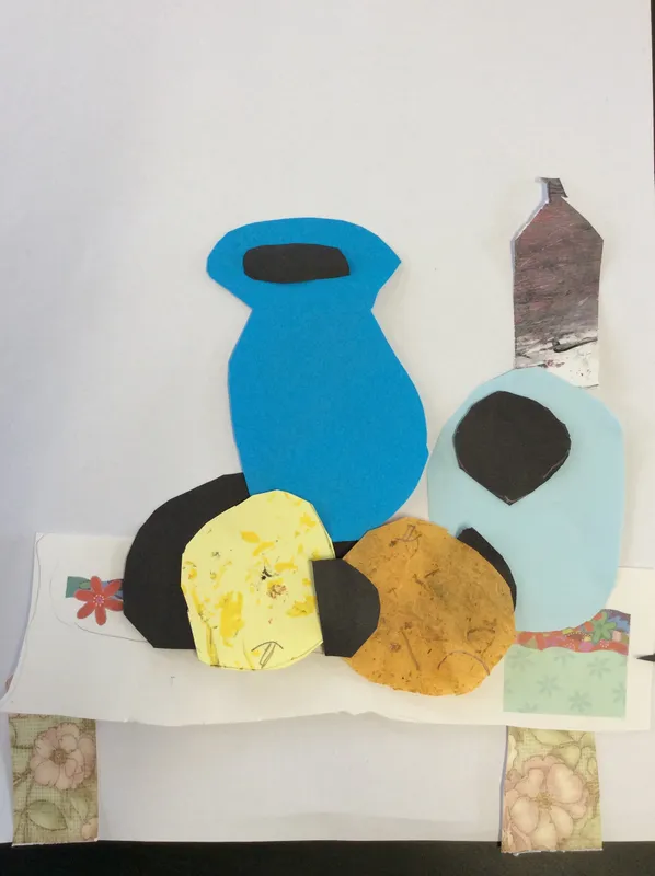
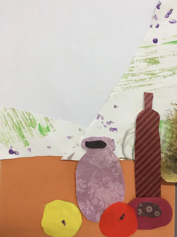
We looked closely at the form of fruit and other objects and how to create depth through overlapping in a still life - in particular seeing where objects start and stop in relation to each other.
We also looked at tone and how shadows are formed away from the source of light. Lastly we used all the skills we had practised in a watercolour still life.
Our sketching and understanding of an objects form and how they overlap was supported through collage too. We were very happy with the result.
Year 3: Pre-History Art - from handprints to Beaker Culture inspired coil pots
We looked at the importance of the handprint in ancient human art and why it might have been used. We found out about how they made some of their paints (seriously gross) and then created our own handprint art. Inside our negative handprints we added items that were important to us e.g. chicken nuggets, art, sports, family, pets, computer consoles etc. What would you include in yours?
Beaker Culture covers an ancient people from Europe, including Britain, and is famous for their distinctive pottery. We looked at the shape and decoration used and created our own version using the coil method. Its was a lot of fun rolling out lots of sausage shapes but it is harder than it looks to make them. To join all our pieces we used the 5 rules - Score, Score, Slip, Wiggle, Smooth. (Slip is a watery clay mix used as a glue.)
Year 3: Weaving inspired by Egyptian Landscapes
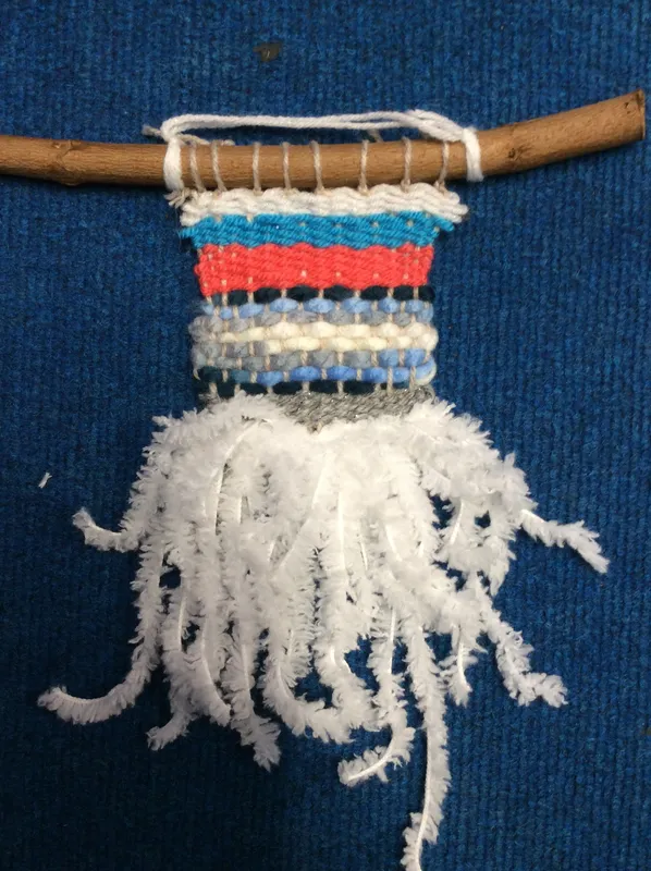
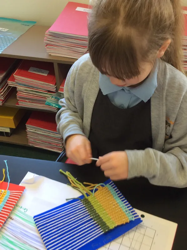
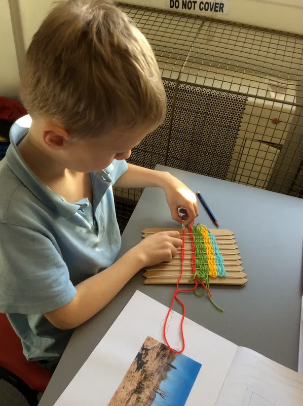
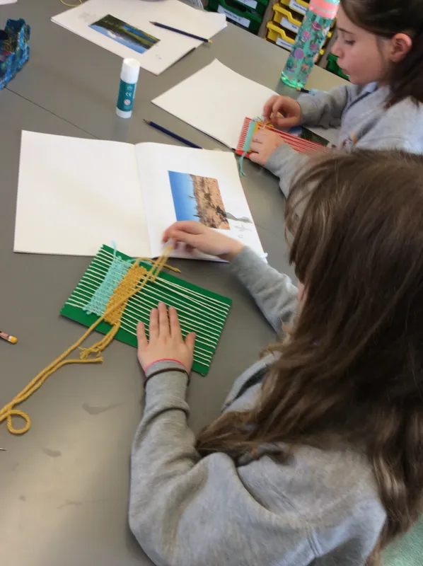
In year 3 we explored the way colours make us feel and how artists use them in their work to evoke different feelings. We looked at landscapes from warm climates, including those from Egypt, using them as inspiration for our weavings. A card loom was used to hold the warp thread, allowing the weft to go 'under over, under over'. It is very relaxing to weave but you have to remember to keep a gentle tension on the weft yarn so the sides are even and straight. We learnt about the different stitches that can be used - the basic tabby stitch but also the rye stitch and how to create shapes within the weaving.
Year 4
Year 4: Natural Disasters - Hurricane
We watched videos of various natural disasters, listening to the sounds as well as watching the movement and visual elements of them. We saw ships on huge seas and winds whipping up plants and other items. We recreated the movements, feeling and noise through the medium of water colour. It was a very dynamic session!
We followed up our dynamic, expressive art with careful collaging based on an onomatopoeia word. We first studied the work of Pop Artist Roy Lichtenstein, looking at his layering and use of explosions shapes, dots and words. We aimed to use up most of the negative space, with large, stand out letters and extra decoration that emphasised the words meaning / sound.
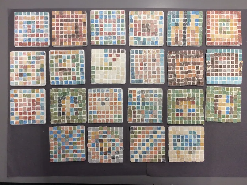
Year 4: Roman Mosaics
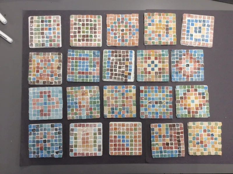
Ancient Rome is often linked with the collage art of mosaic-making. We investigated the different jobs that were involved (there are many) and had a go at trying it out with paper tiles as well as planning a design to create using actual tesserae. This is a very fiddly process but we did really well and created some very intricate patterns.
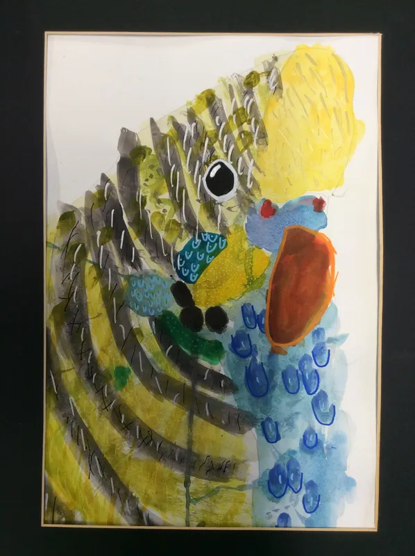
Year 4: Grotti Lotti Inspired -
Messy Birds
As part of our topic on endangered animals and linked to the RSPB Big Garden Bird watch we set out to discover the beauty and challenges faced by our native birds. We looked closely at their form through videos (helpfully pausing the video as they never stayed still when watching them in our school woods), listening and drawing their song and close observation of feathers. Our finished pieces were inspired by the paintings of Australian artist Grotti Lotti. She allows paint to find its own path, dripping and merging together, We experimented with this and had lots of fun making different marks and seeing what the paint did. Our final layer was added using Posca pens, adding the details we had seen when studying features. The end results were beyond all my expectations - beautiful.
Year 5
Year 5: Alien and Space Plants
During this project we explored two different types of sculpture medium - clay and Modroc. They are both types of additive sculpture, but when using the Modroc an armature of scrunched up newspaper was used to model on top of. Some pupils also used subtractive methods, removing clay to create skin texture. In general we were pretty split between which was our favourite medium.
As part of our planning process we thought about the environment the alien and plant lived in. Was it a cold/warm/dark/swampy place? How did the plant and alien co-exist? There were some very involved backstories! These are some of our truly gorgeous creations.
Year 5: Ancient Greeks
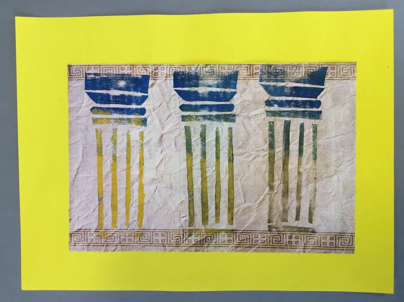
We have been studying the architecture of Ancient Greece, in particular the different columns they created - Doric, Ionic and Corinthian. We learnt about their different sections through sketching, then created our own prints (reduction printing / foam block printing) inspired by them, printing on a variety of different types of paper, exploring the different results. Finally, we collated all our art together, selecting and choosing the prints we wanted to share. The foam blocks were still tacky with printing ink so we had fun adding ghost prints to our sketchbooks too.
Ask any year 5 and they will tell you columns have teeth, moustaches and sausages! Really, they do!
Year 5: Rainforests
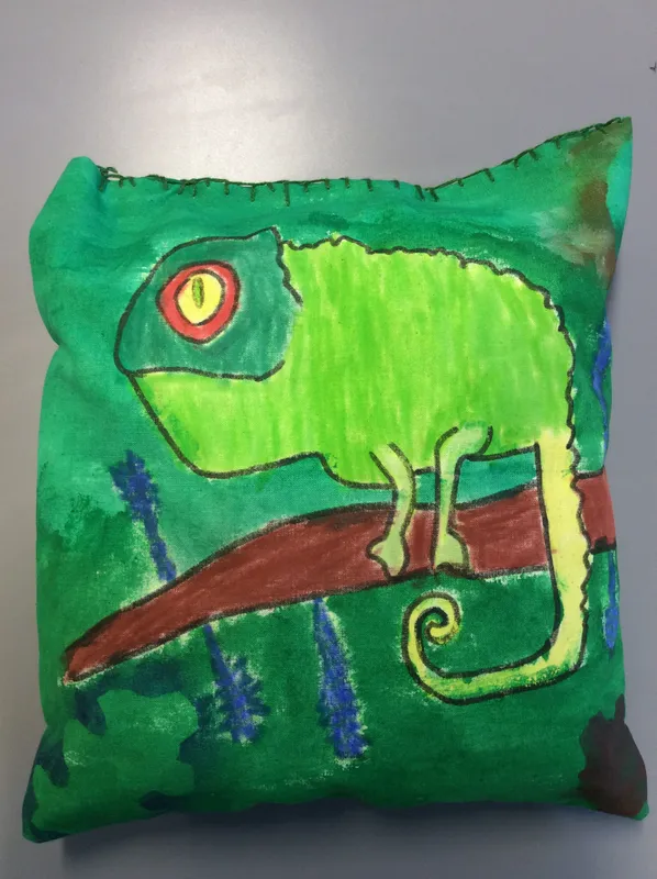
During this term we have learnt about different animals that live in rainforests and saw how other artists have explored the topic e.g. Henri Rousseau who painted amazing jungle scenes but never actually visited one! We chose our favourite animal to create on cushions using fabric paint. We explore their form and how we could use up the space. We added an outline to make the animal stand out and used stencils to add forest foliage around the edges. Once 'set' we stuffed them and finished the tops off with blanket stitch.
They look fantastic - well done Year 5.
Year 6
Year 6: Artist Study
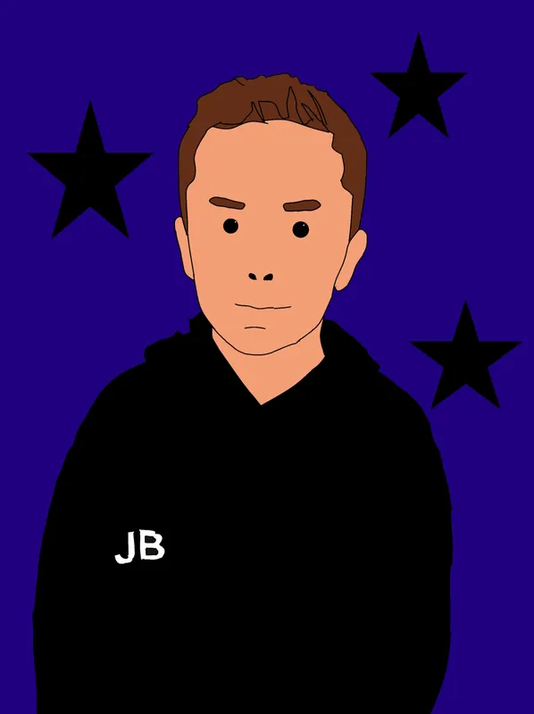
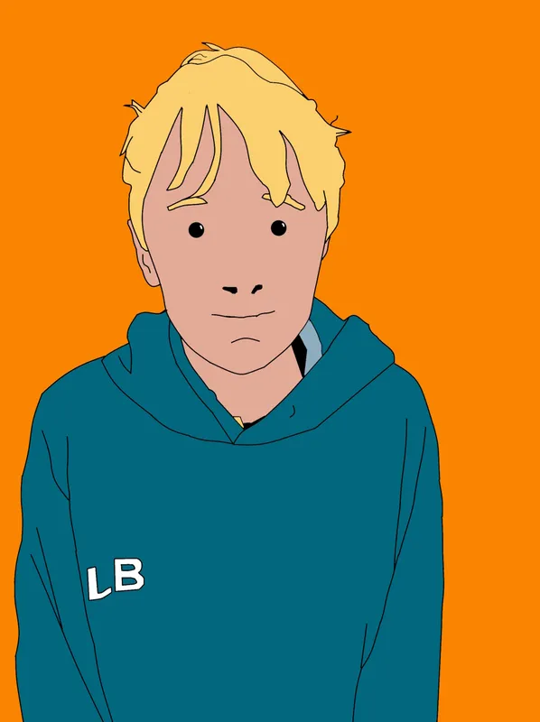
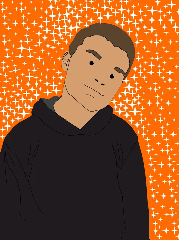
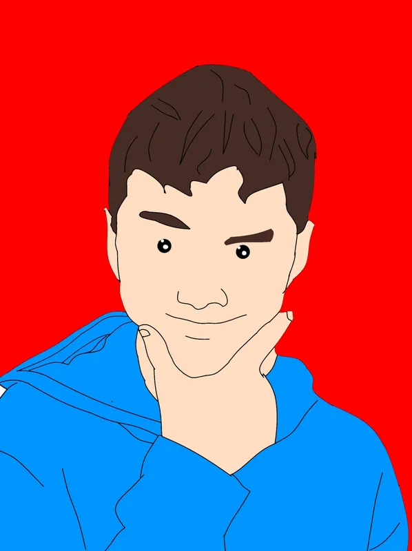
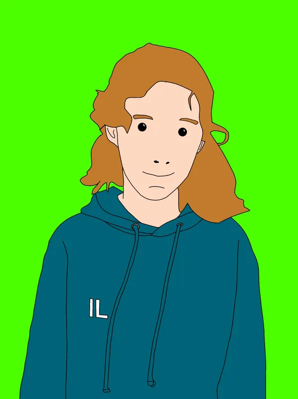
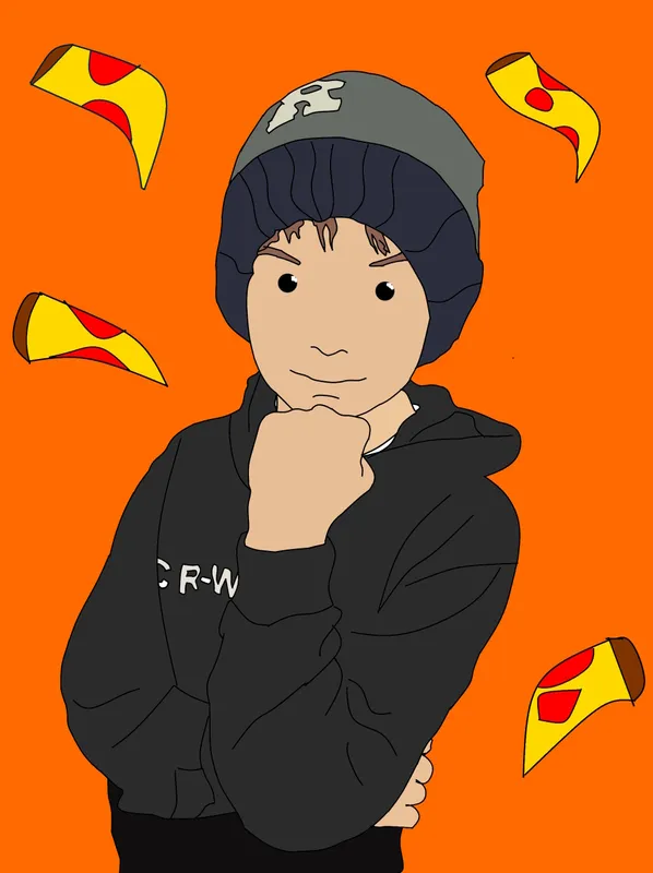
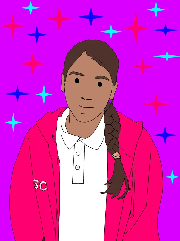
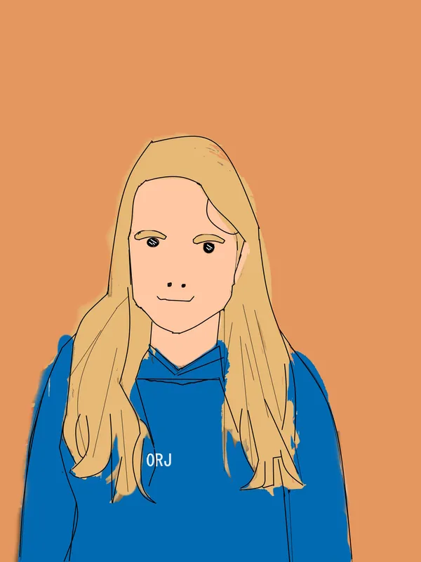
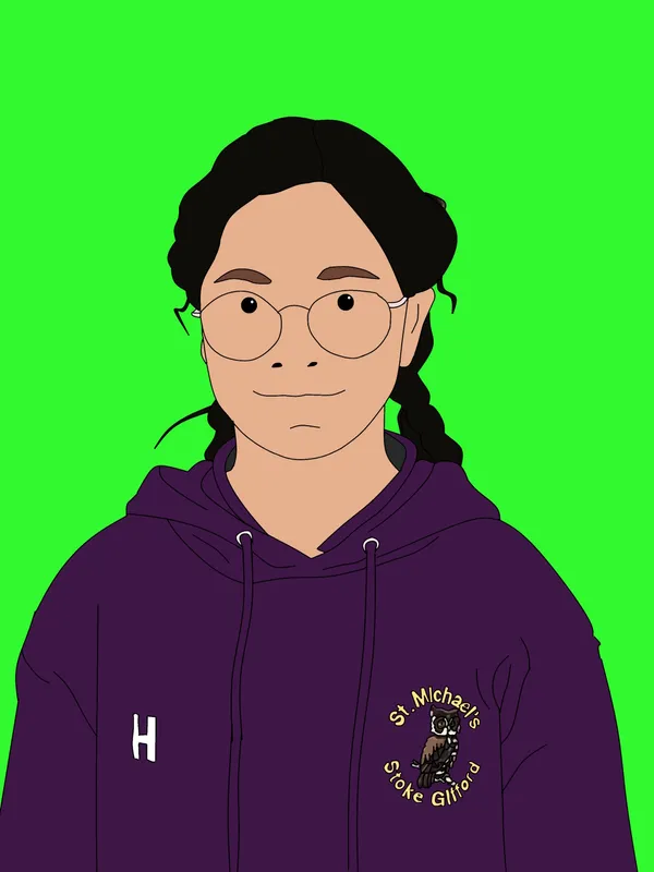
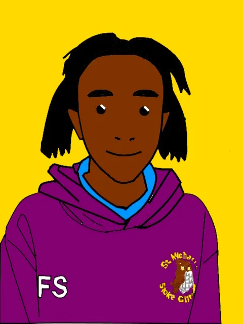
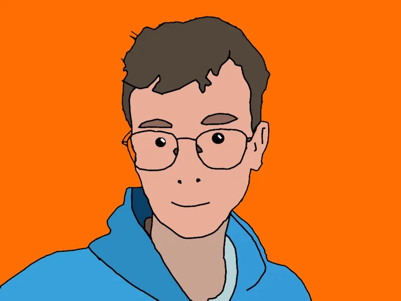
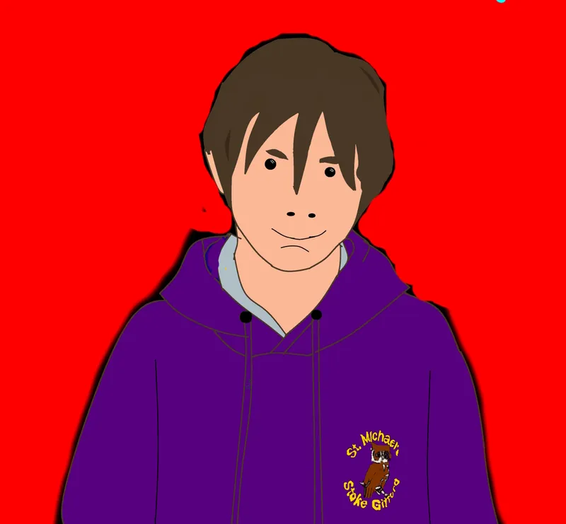
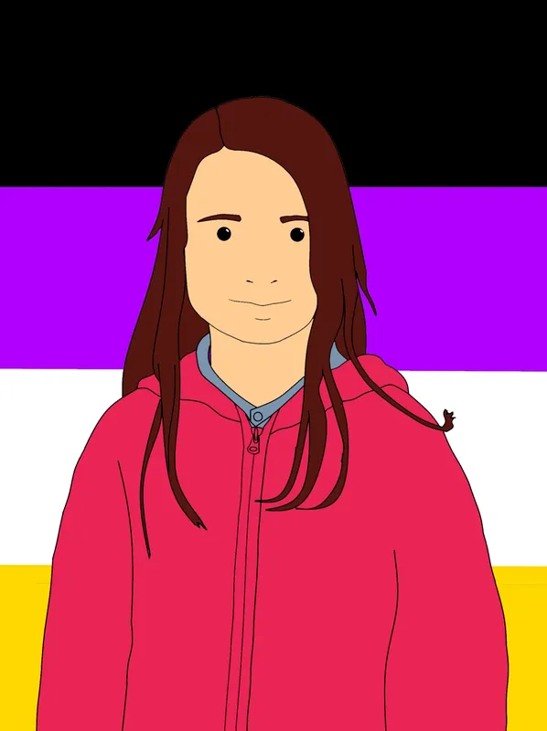
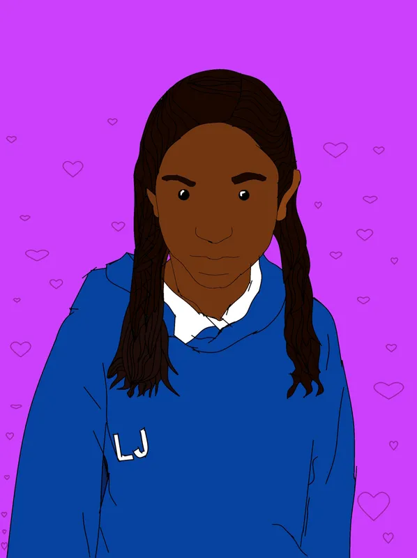
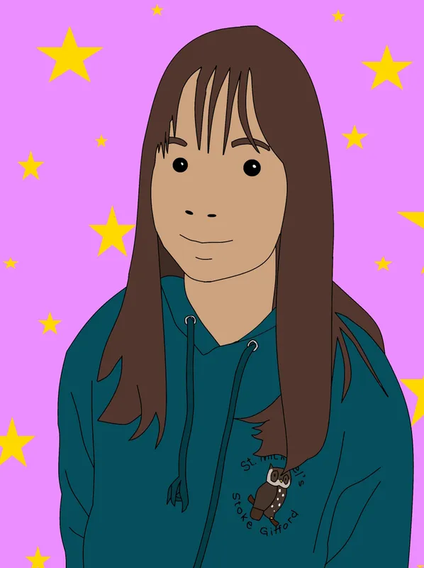
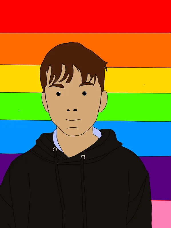
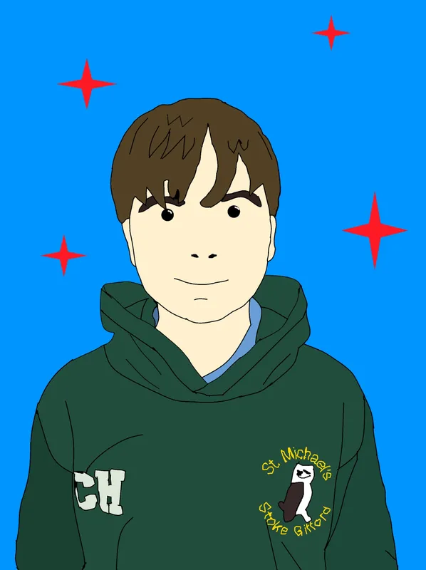
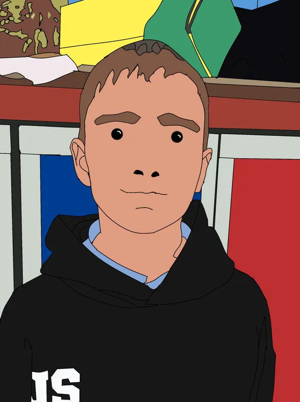
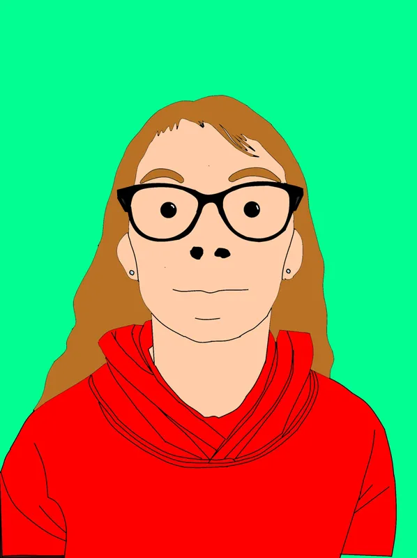
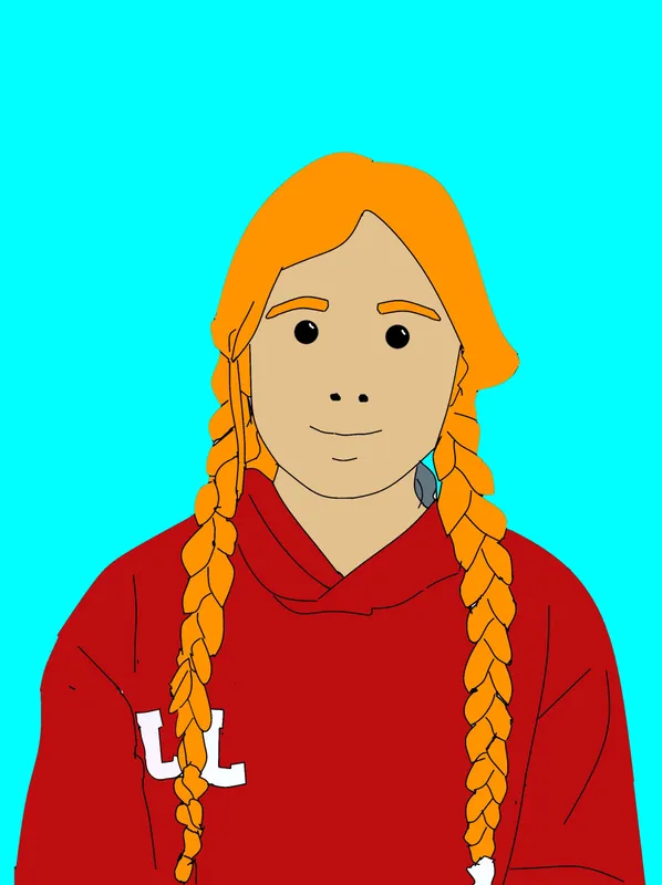
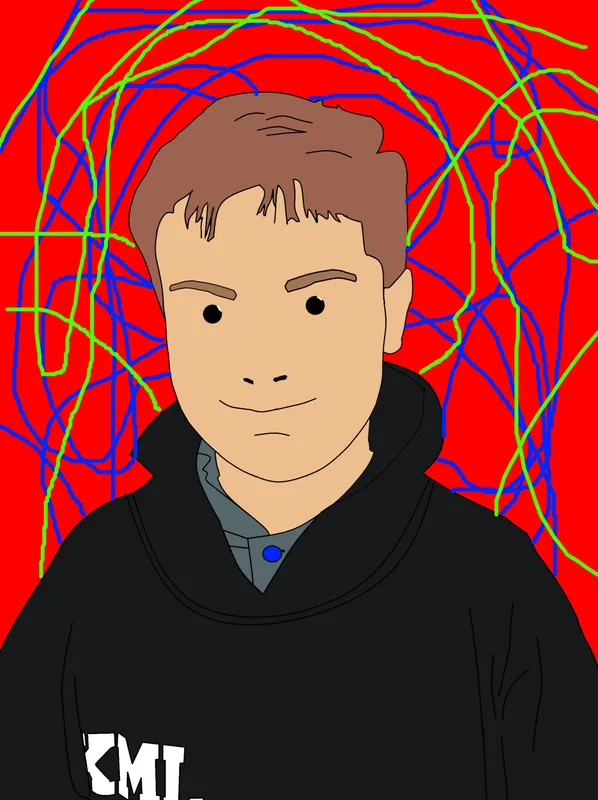
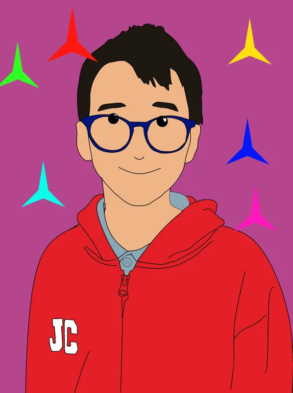
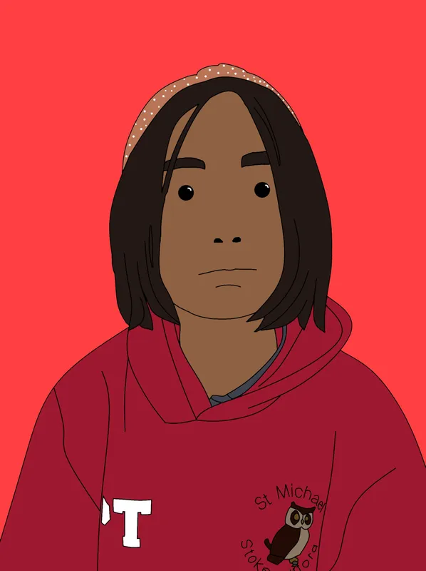
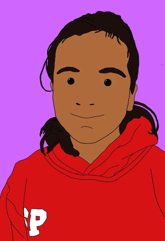
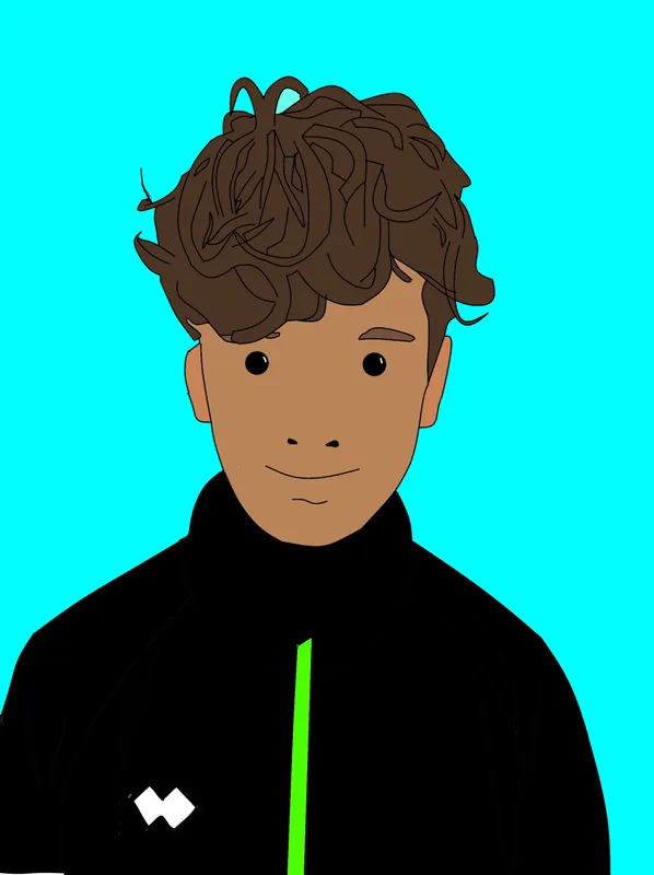
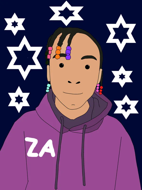
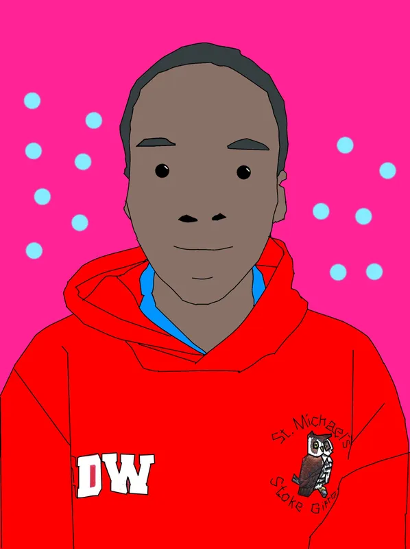
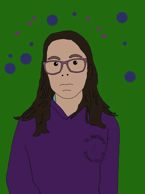
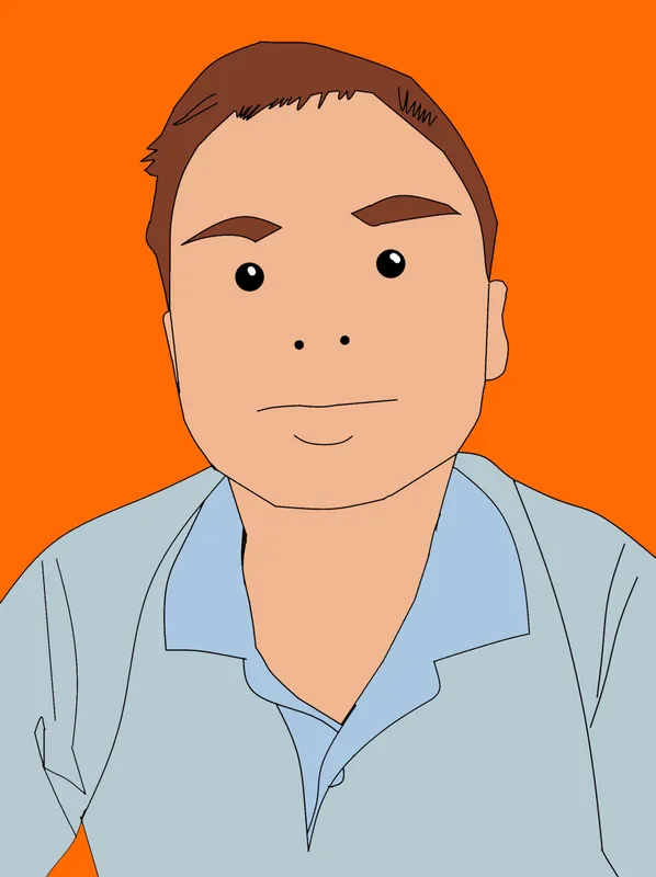
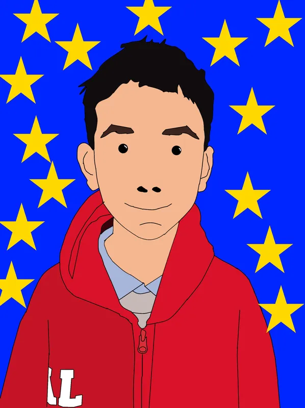
Using the computer programme Paint.net and taking inspiration from Julian Opie's digital art, we created our own cartoon like portraits. Bending the lines to follow our faces took time - especially the hair, but the results were worth it.
These will be part of our Year 6 Yearbooks given out at the end of the year.
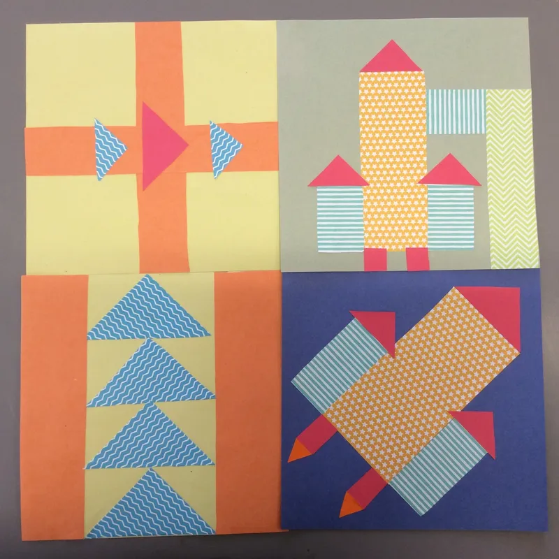
Year 6: Railroad Quilts
For this code project we took our inspiration from the quilts used by African Americans in their journey to freedom from slavery on the Underground Railroad. We researched some of the main quilt patterns and their meanings and learnt about some of the people who had experienced this very difficult journey. We thought about journeys we had been on in our own lives and how we could pass the details of these on to others through the use of coded patterns. These we planned using mainly geometric shapes that could be produced as paper quilt blocks. It was important to be accurate so that the pieces fitted together. Can you guess what the codes might be telling you?
Year 6: Henry Moore -
WW2 War Artist
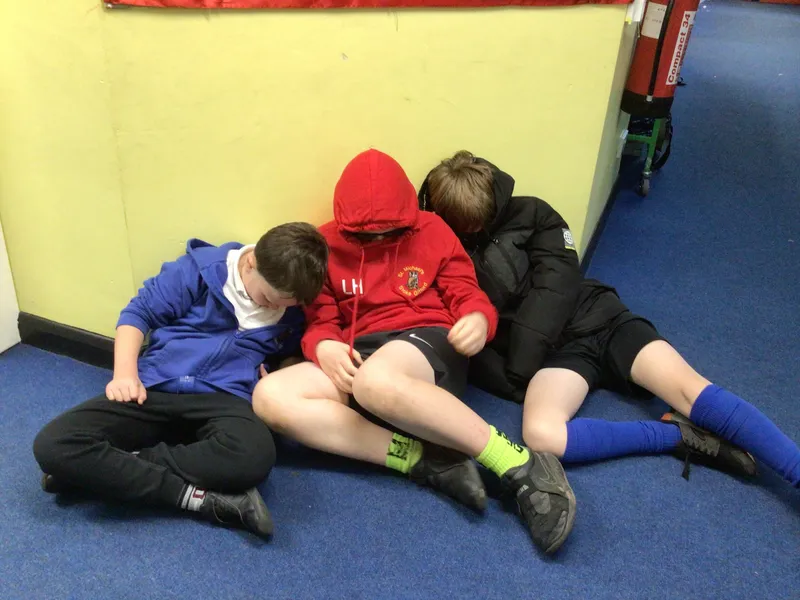
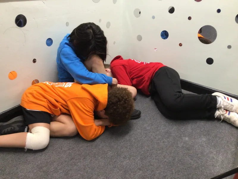
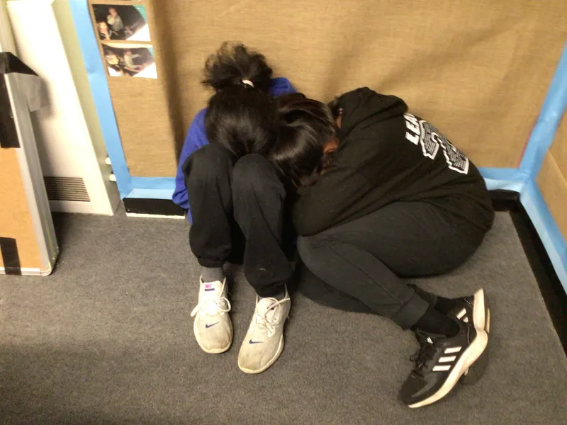
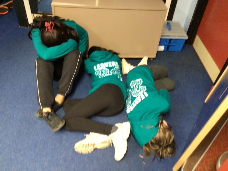
Henry Moore is mainly famous for his monumental sculptures. What is less well known is his drawings from the underground tube shelters during the London Blitz. We explored how he used various, simple materials to create tonal drawings of human 3D forms.
Using ipads, we had a go at organising our own compositions for a 'shelter huddle'. We thought about the relationship between the figures and how we could use contouring to show the 3D form of each body part.
The results are very impressive and you do get a feeling of the claustrophobic, dark and scary nature of the situation.
Previous Projects
Year 4: Painted Perspective - River Landscapes
Whilst some of Year 4 were on camp, those back in school took part in a two day art project. We looked at a lot of different types of water and discussed landscape perspective - how things look larger the closer they are to us. Before starting our final paintings, we explored the medium of water colour, how direction of brush mark is important and how texture marks can be added.
Year 3: Stone Age
We explored the importance of the handprint in Stone-Age art and how they created their own paints. (Yuk!) We created our own handprints in charcoal, chalks and ink, incorporating things that are important in our own lives. To decorate these we added a colour wheel (understanding that we can make colours now that they couldn't in Stone-Age times).
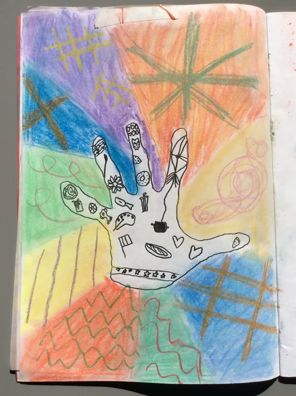
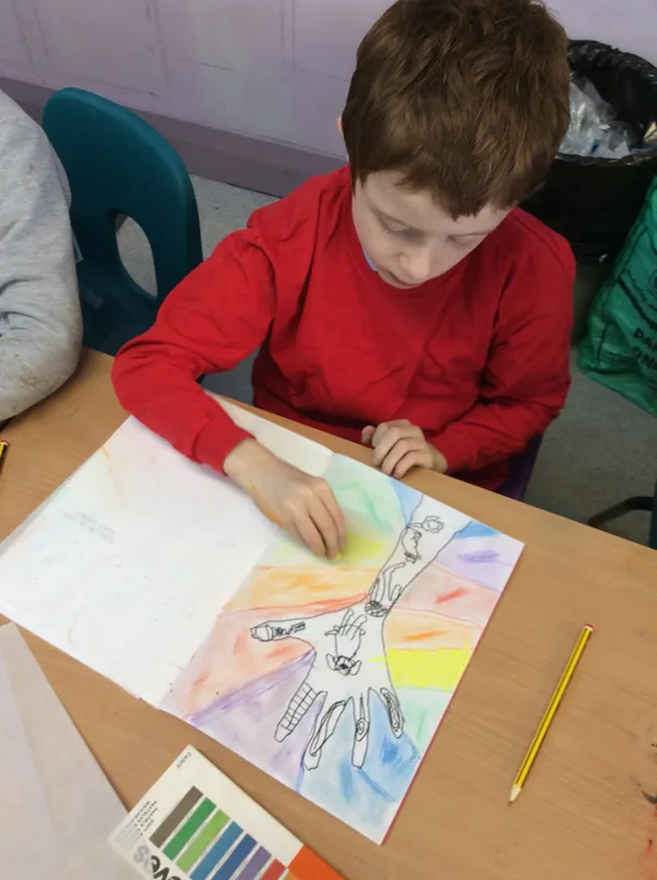

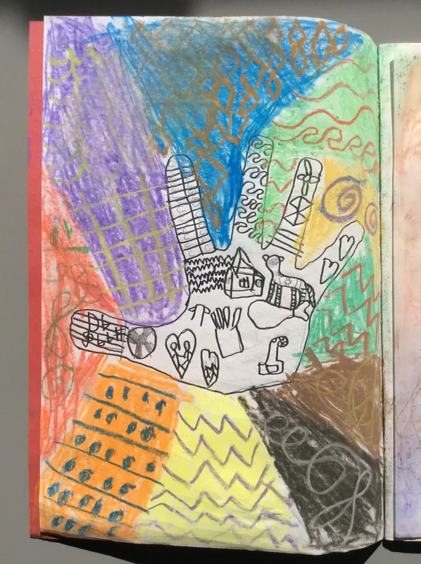
Finally, we looked at the pots made by the Beaker Tribe and created our own, developing our manipulation of clay by making coil pots.
Year 3: Polar weaving
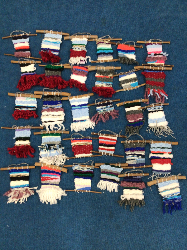
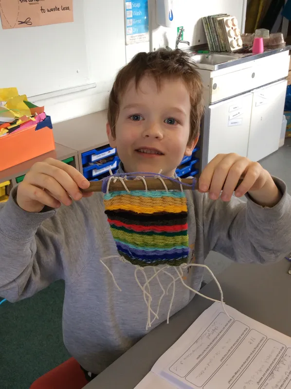
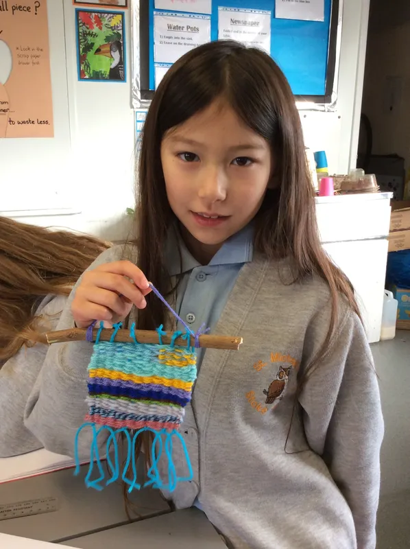
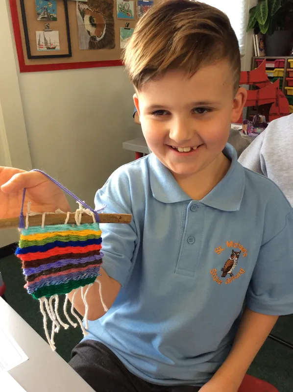
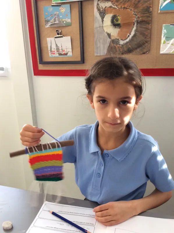
In year 3 we explored the way colours make us feel and how artists use them in their work. We looked at landscapes from cold climates, including those showing the northern lights, using them as inspiration for weavings. A card loom was used to hold the warp thread, allowing the weft to go 'under over, under over'. It is very relaxing to weave but you have to remember to keep a gentle tension on the weft yarn.
Year 4: Roman Mosaics
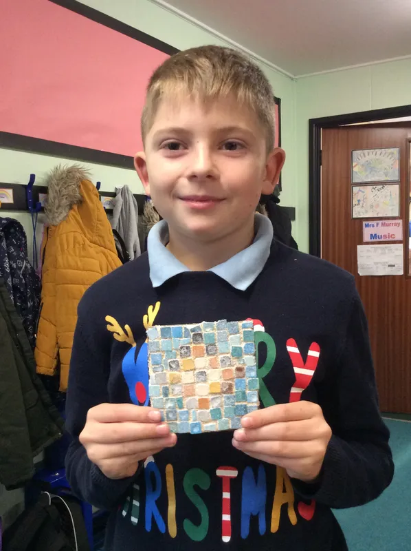
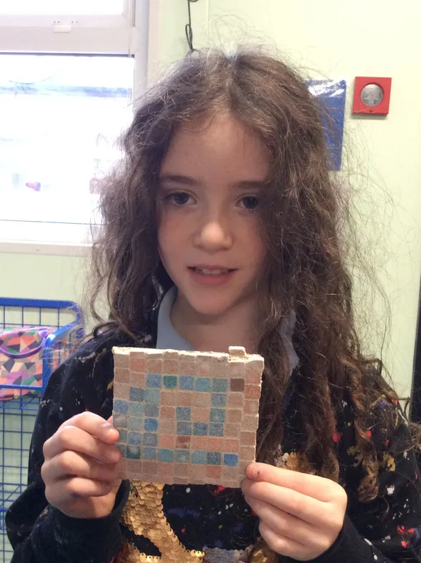
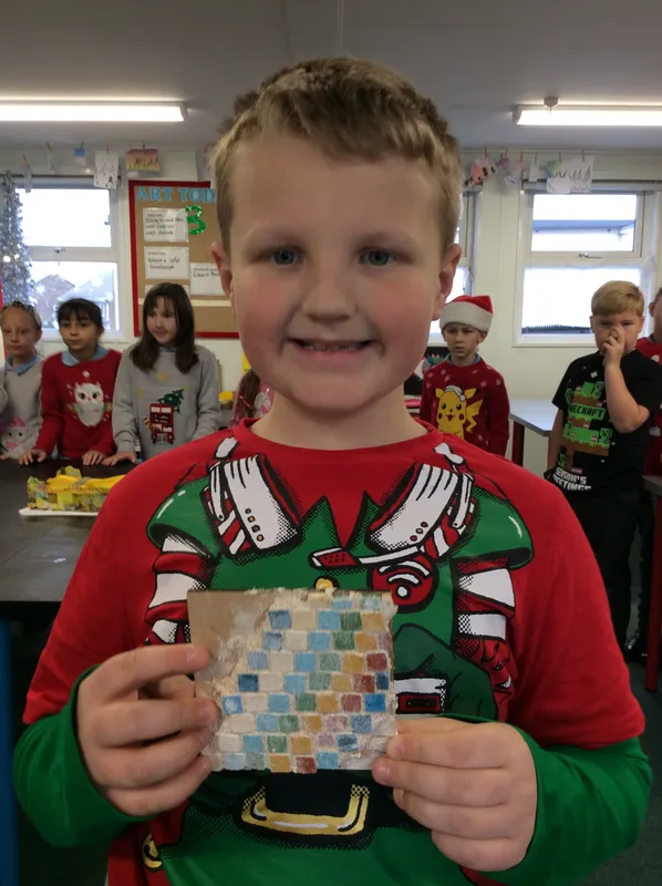
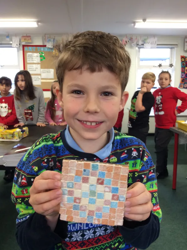
We looked at a range of Roman mosaics and how the Romans created them. Beginning with paper squares, we had a go at creating lines and shapes, making sure there were small gaps in between them. This is harder than it looks! The Romans created very detailed pictures but as we were just starting out, we focused on the patterns they used. Once we had chosen a pattern we transferred it to a board using small tiles (tesserae). Some we had to cut with tile cutters which we had to use very carefully.
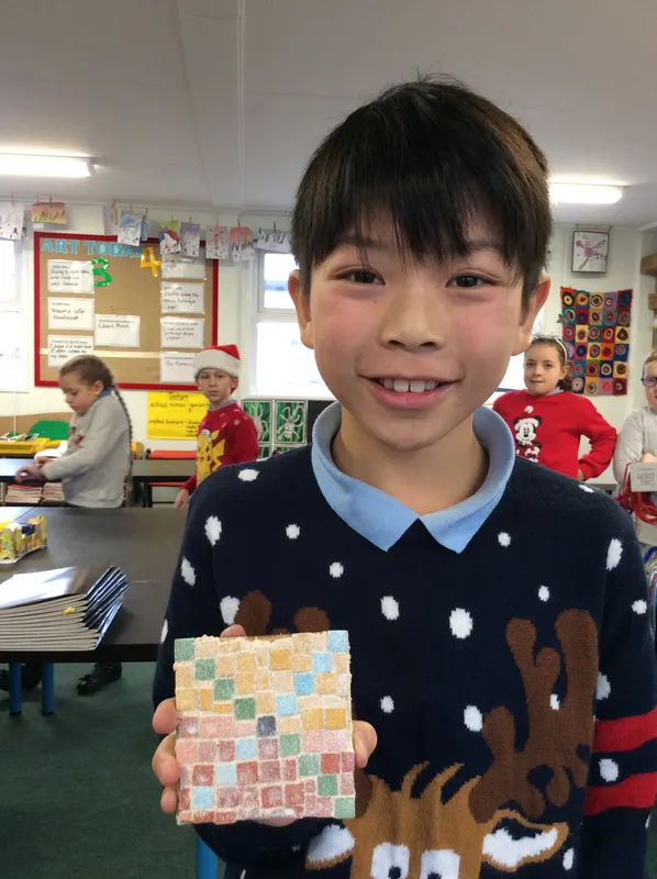
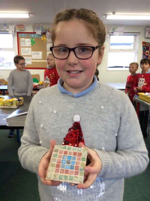
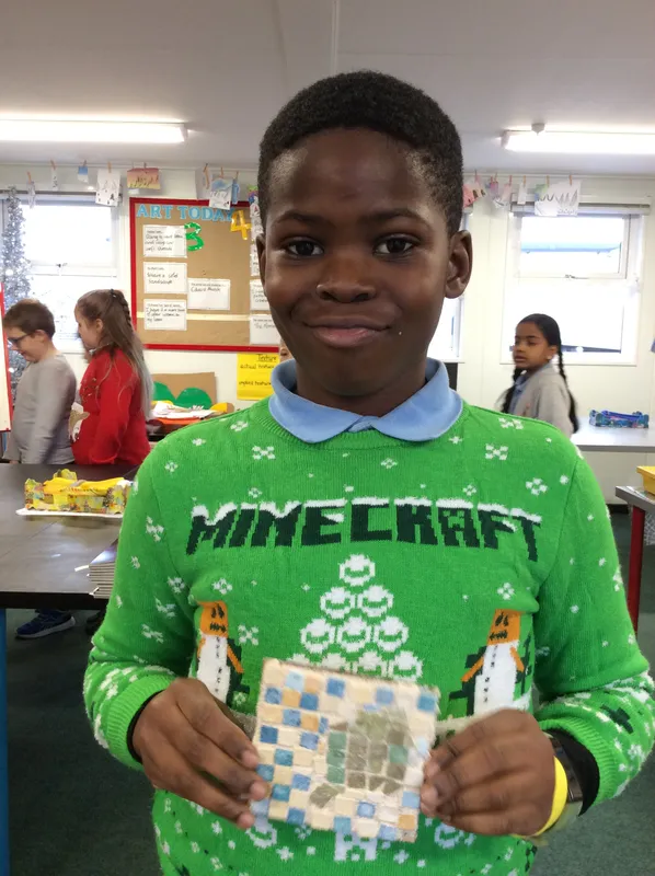
Year 3: Egyptians
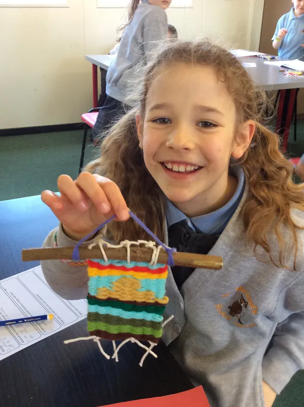
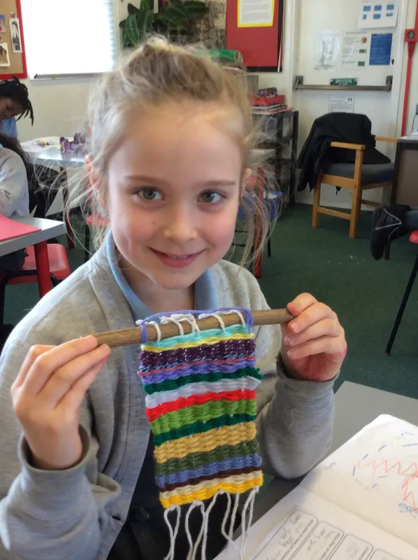
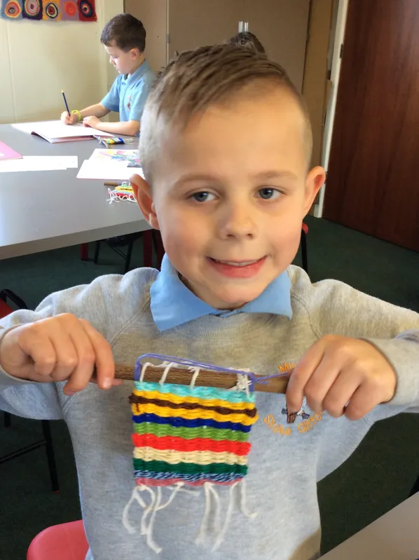
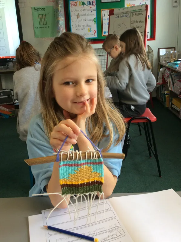
In our Ancient Egyptian topic we created drawings of pharaohs, gods and other people using a grid, follow the same rules that they did. We also studied the landscape of Egypt, looking in particular at the River Nile, mud brought by the floods, green planted areas and the sky. We creating weavings to represent these layers, some of us even having a go at putting pyramid shapes into them - it's hard!
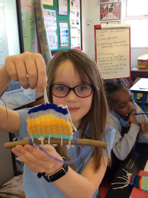
Year 4: Endangered
During our topic Endangered we studied some of the most threatened animals in this country. We looked closely at their form (shape) and the texture on their bodies and surroundings. Watercolour paints were used to add colour inside a frame, with us all really focusing on our colour mixing skills.
Year 5: Crime and Punishment
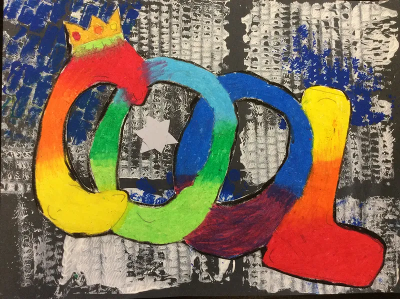
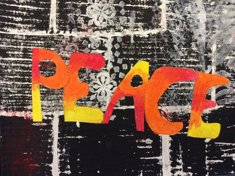
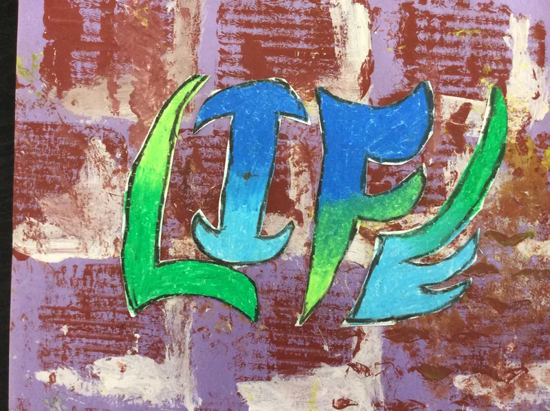
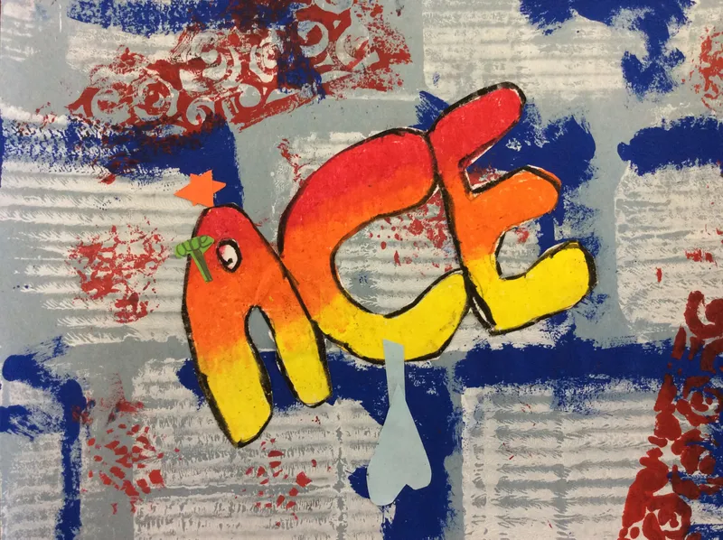
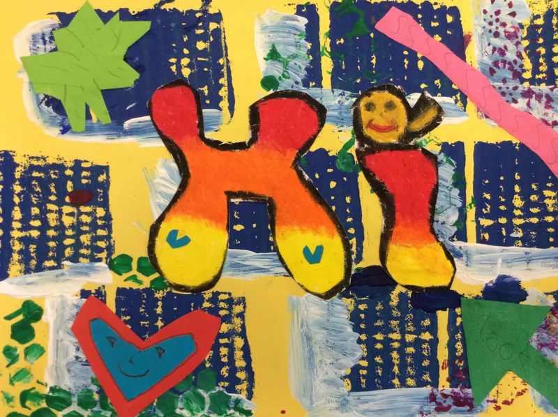
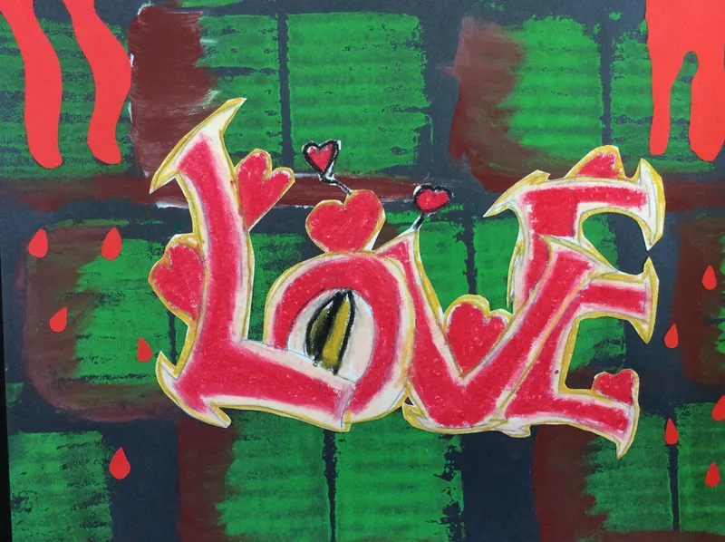
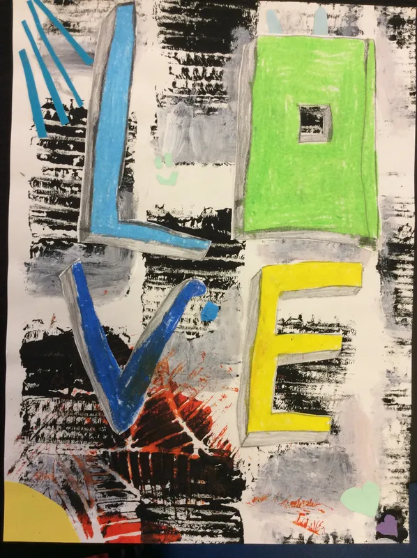
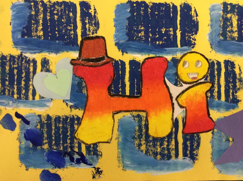
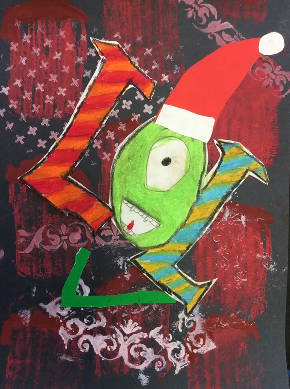
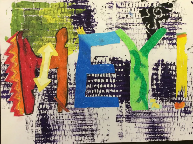
Studying graffiti has been an interesting topic and we've noticed many types around Bristol, particularly focusing on the legal street art variety! We created our own printed brick walls then added a oil pastel blended tag with accents.
Year 3: Artist Stydy - William Morris
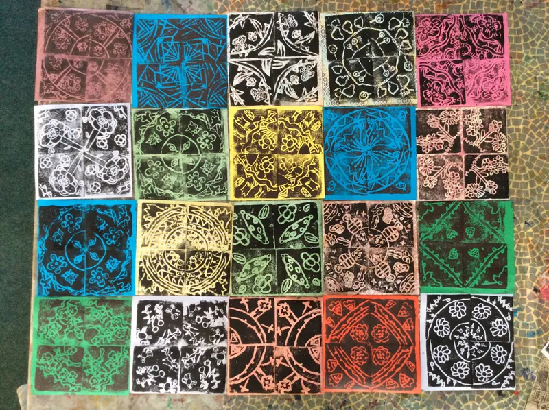
We began this project by learning about the life and work of William Morris. Looking closely at examples of his wall paper and textile designs, we noticed his use symmetry and translation when depicting flowers, leaves and animals. Drawing on this, we created our own compositions for a collagraph plate, using pieces of cardboard, string, pipe-cleaners, matchsticks and corrugated paper. We explored the use of the different textures to make our collagraphs interesting. During this process we learnt that keeping our designs big and bold made them easier to make and created a clearer print! These are some of our collagraphs before we 'inked' them.
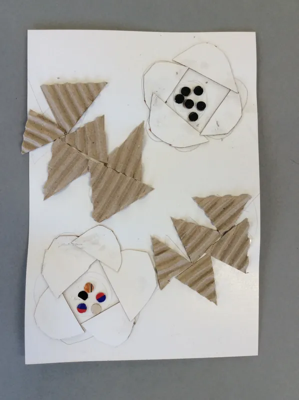
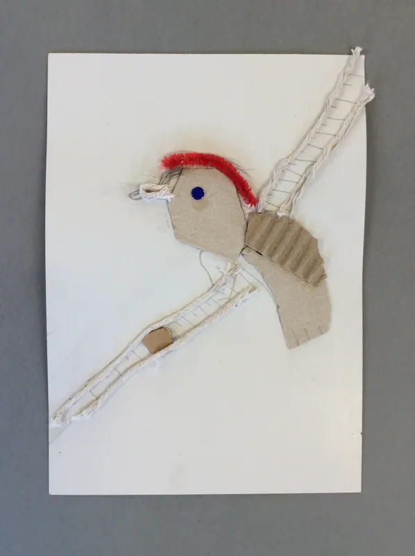
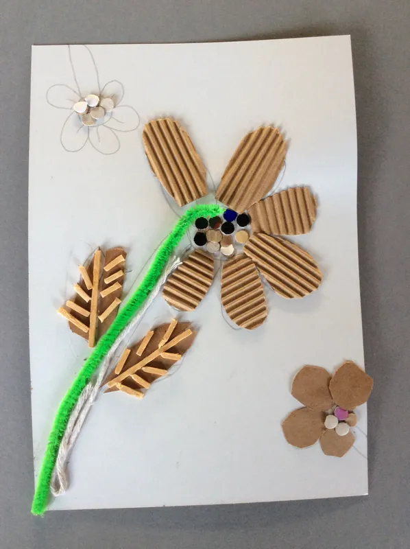
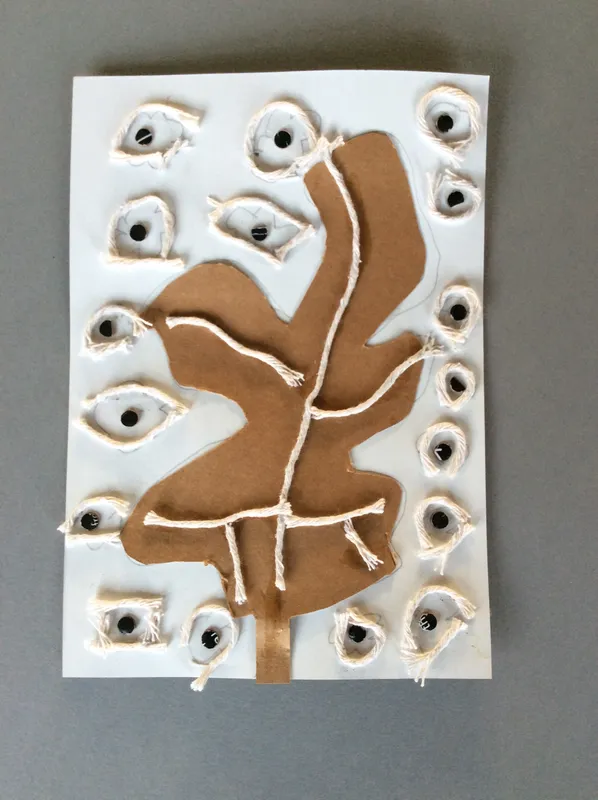
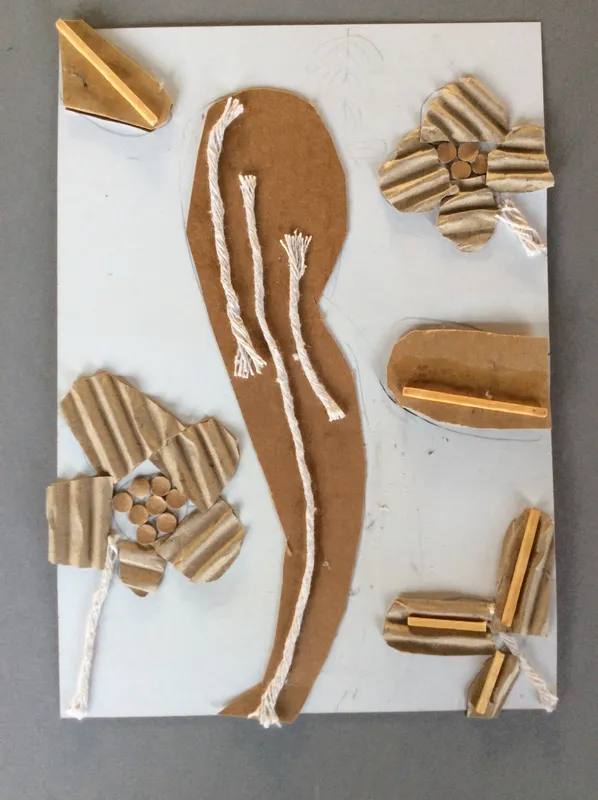
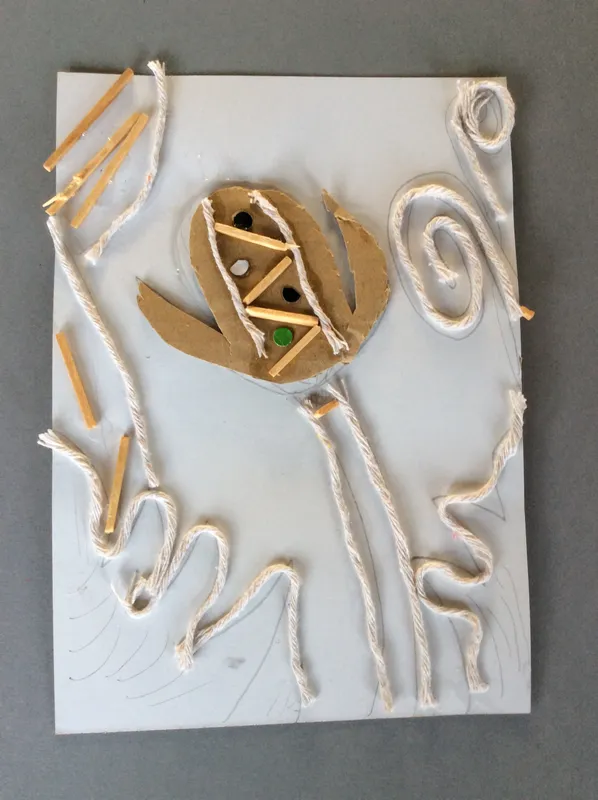
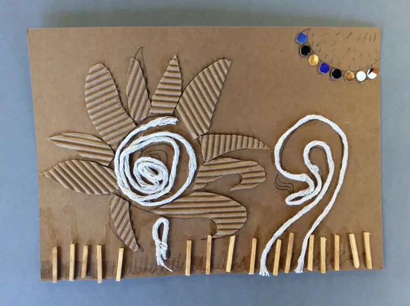
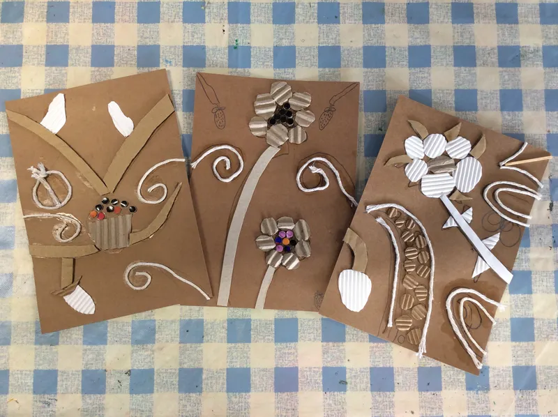
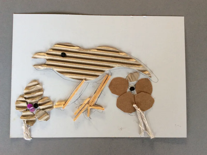
Once the glue on our collagraphs had dried we could then print from them. Lots of force was needed to get a successful print - you really had to get your fingers in to all the little corners. The results were fantastic and the inked collagraphs look like pieces of art in their own right too.
During our printing topic we also explored rotational polystyrene press printing. Continuing to use William Morris' work as inspiration, we planned a design that could be rotated around a central point. We used the same sort of process as the collagraphs but rather then raising up the design we pushed it into the tile. We also added a sticker to the centre point to help us remember which corner needed to be in the middle.
They look even better than we expected and many 'oooh's and arhh's' were heard when revealing them!
Year 5: Portraits
As part of our Tudor topic we looked at Holbein and how his portraits helped shape our understanding of Tudor England. We explored the 'magic' proportions of the face and had a go at creating our own using pencil, then a larger try in charcoal. I was blown away by the mark making and effort the children put in to getting the features in the right places. We are now going to develop our portraiture work into the 3D medium of cardboard relief sculpture using Kimmy Cantrell as our inspiration.
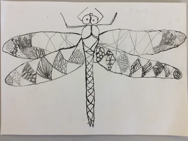
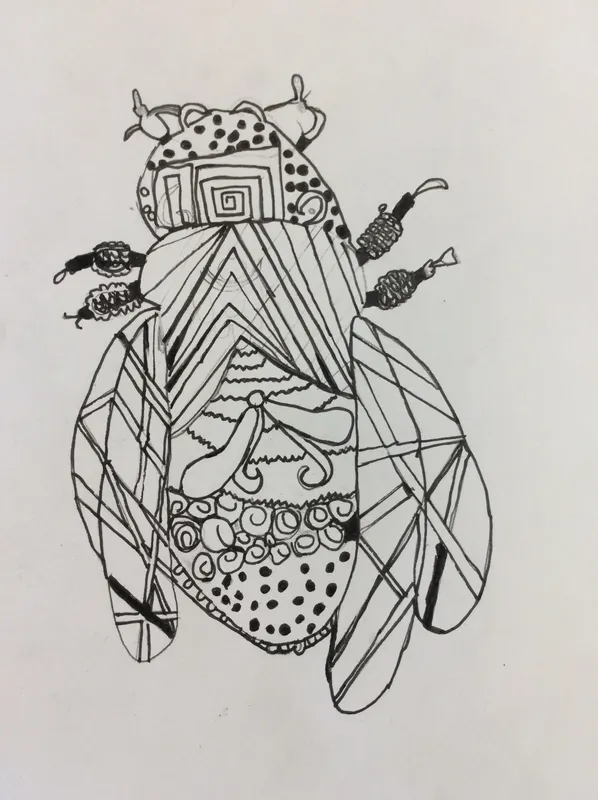
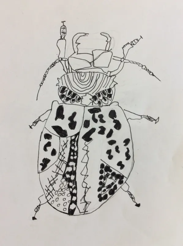
Year 4: Artists Study - Rosalind Monks
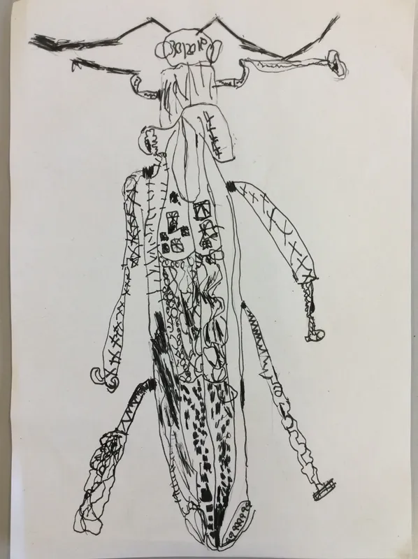
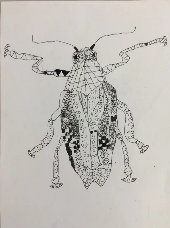
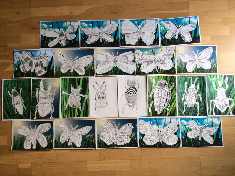
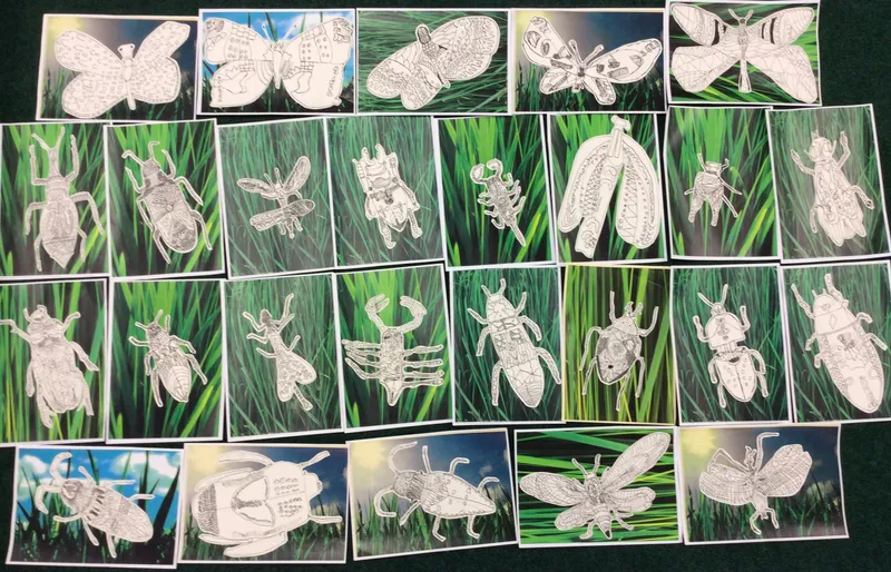
This year we looked very closely at the bodies of different British insects, many of which are endangered. We were really surprised at how intricate and beautiful they were. We were also inspired by the work of designer Rosalind Monks, who works in pen to create detailed designs.
Here are a few pieces of our pen work, some done at school and others whilst home learning.
Artist Response - WOW
Hi Mrs Fraser and Year 4,
Thank you so much for sharing your wonderful drawings with me. I am so impressed with all the detail and care you took with your line work. Drawing in pen is hard because you can’t erase anything, you just have to adapt if you make a mistake! I am so honoured to have inspired you all to create your own beautiful artwork. Drawing is very special to me and I couldn’t imagine life without it. I love being out doors and finding new things to draw, the possibilities are endless. I very much hope that creating these brought you the fun and magic it brings me and please keep up the great work!
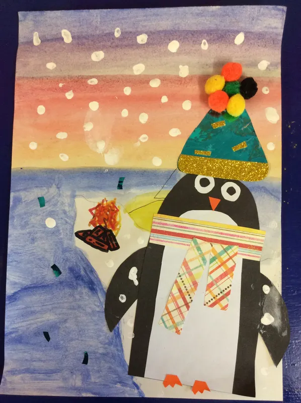
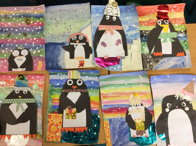
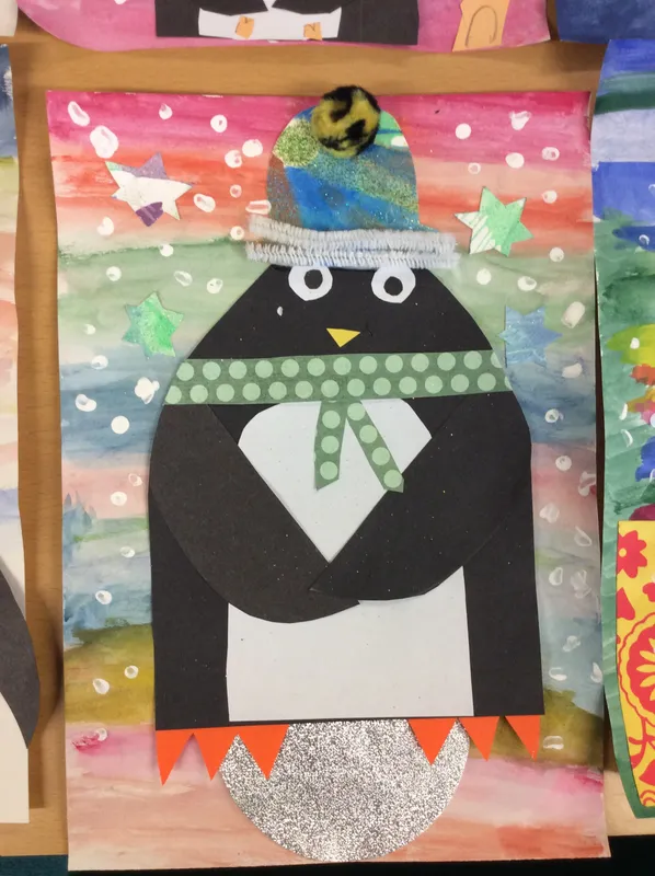
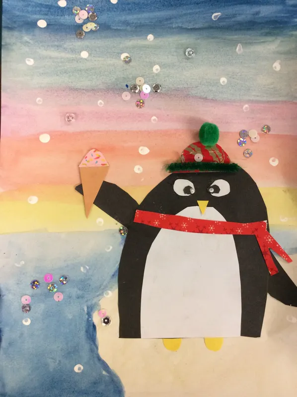
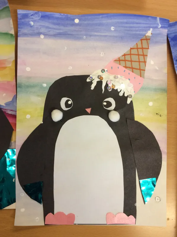
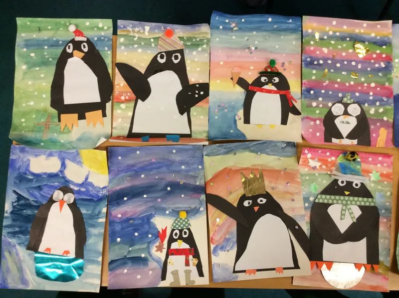
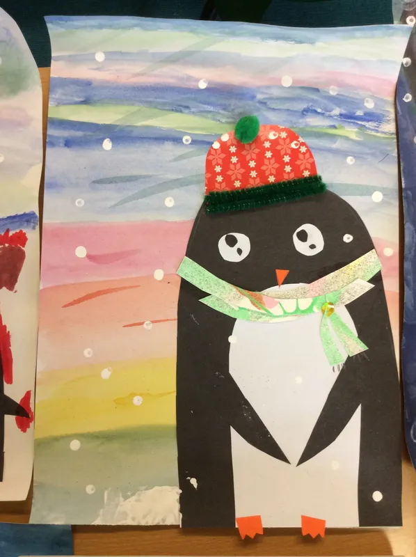
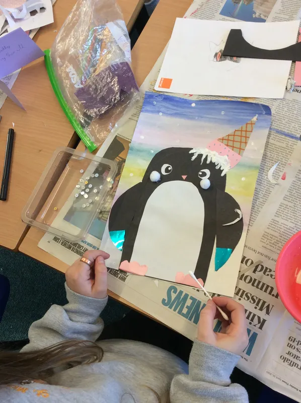
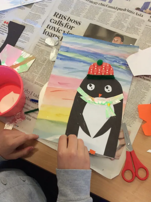
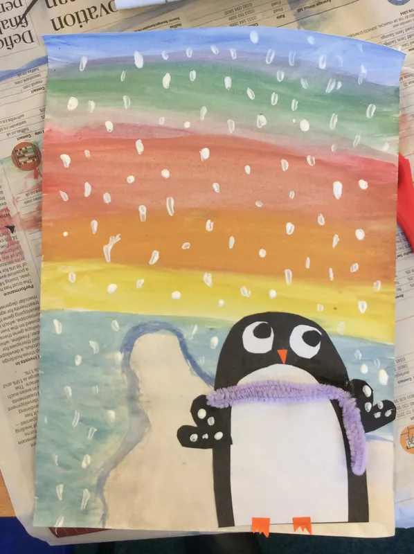
Year 4: Winter Penguins
We created a sky watercolour wash and then collaged on top with our weird and wonderful penguin characters.
Year 4: Natural Disasters
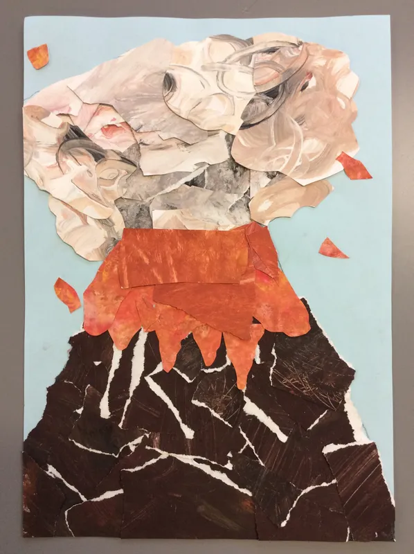
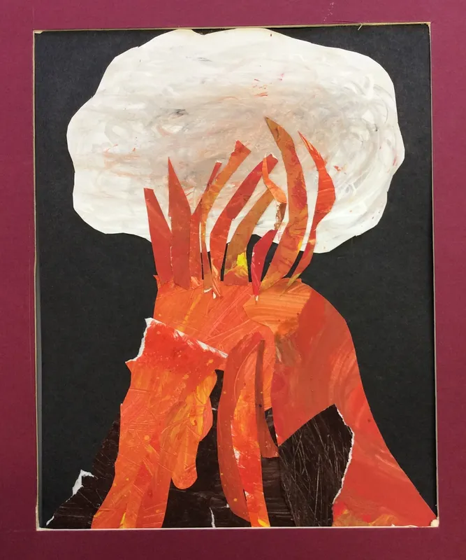
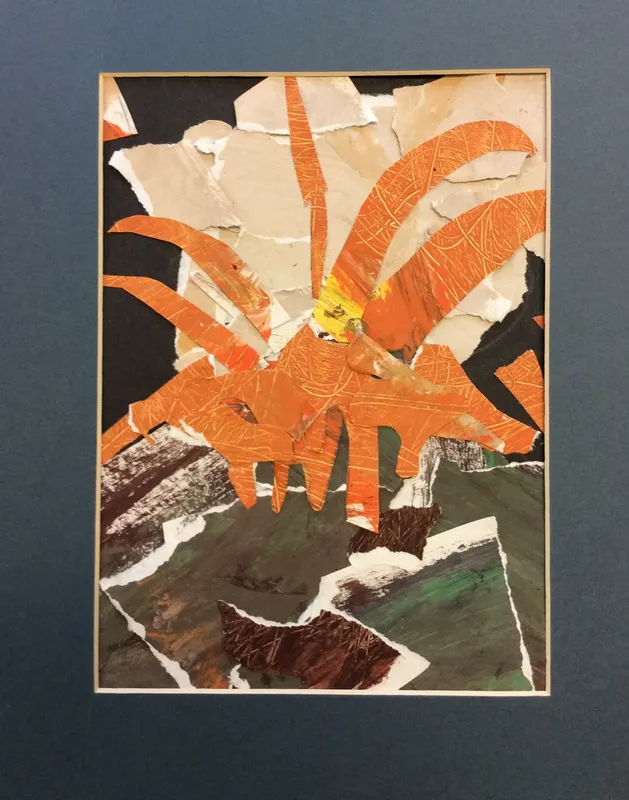
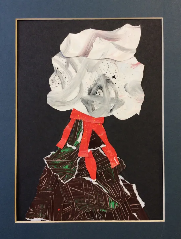
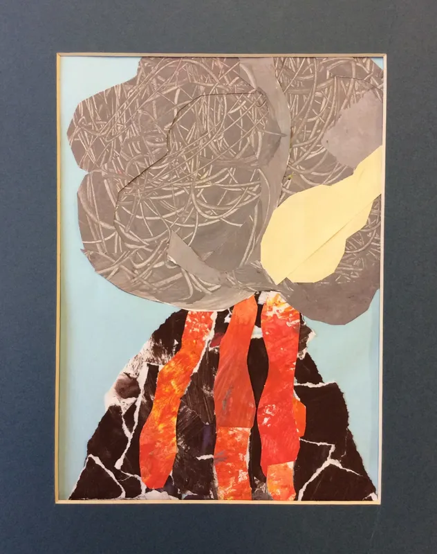
As part of a topic looking at Natural Disasters, we explored the form of volcanos, creating them in collage. First, we used paint and lots of interesting items to create the different textures we observed in volcano pictures. We then tore, cut and arranged pieces to make the 3 distinct sections of an exploding volcano.
Continuing our collage theme (and explosions) we explored the work of PopArt artist Roy Lichtenstein, making onomatopoeia compositions.
Year 4: Surrealist Vikings!
We linked our history topic on Vikings with Surrealist Art. Yep, strange, but that Surrealism - strange items that are placed together to surprise and make you think!
In the particular project we took inspiration from 'The Son of Man' by Rene Magritte. Magritte wanted to see what was behind the things we can see so we created different overlapping layers. We also allowed a little corner of one eye to be seen, just like in the original. Here are some of our interpretations of these pictures using the computer programme Paint.net.
Year 5: Alien Creatures
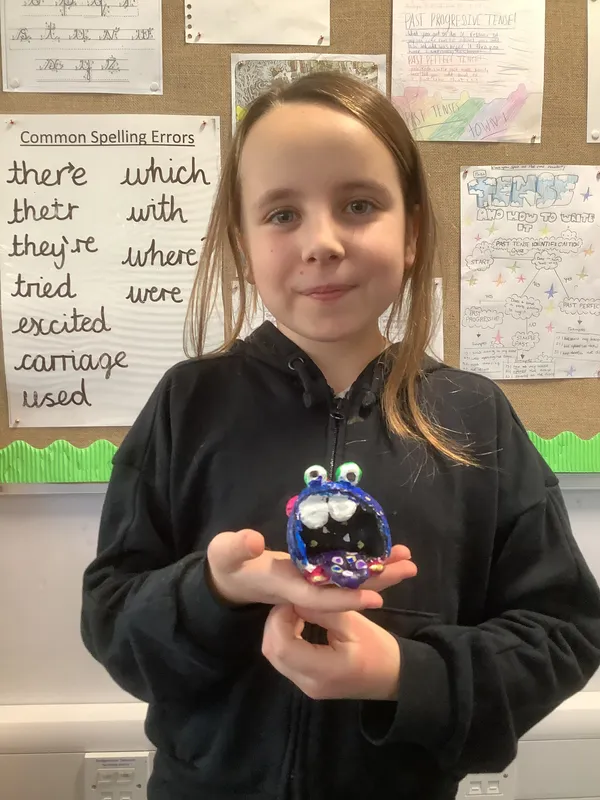
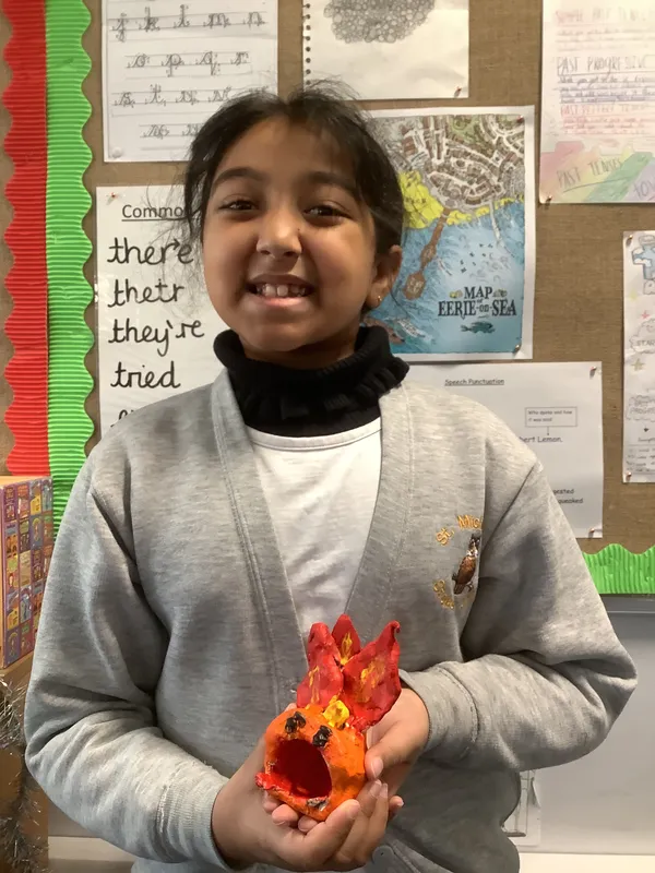
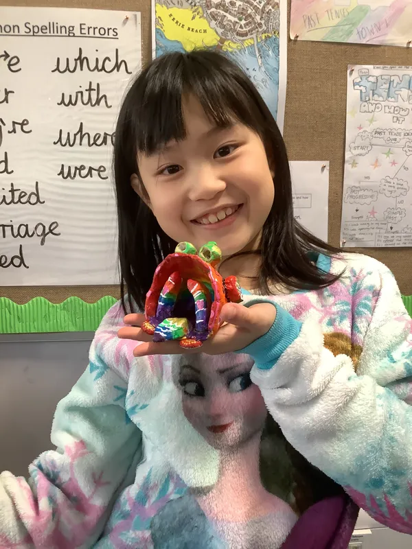
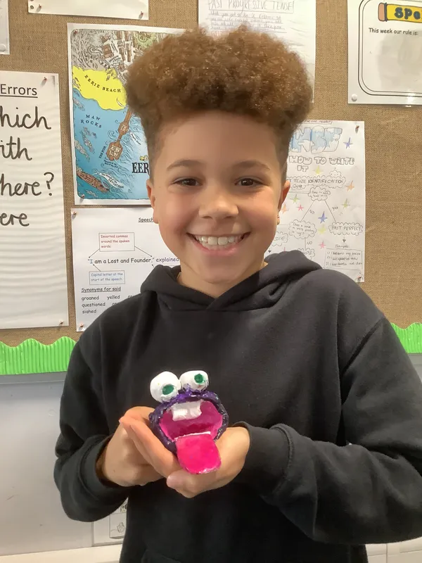
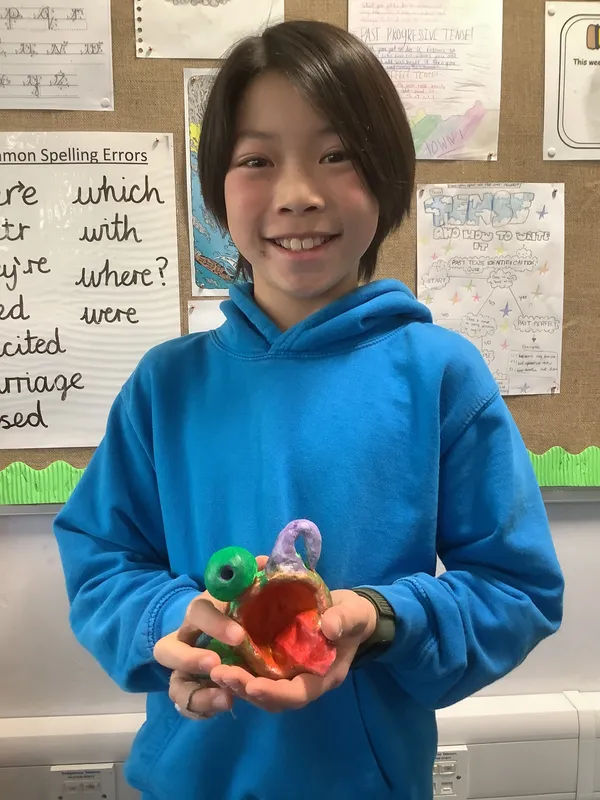
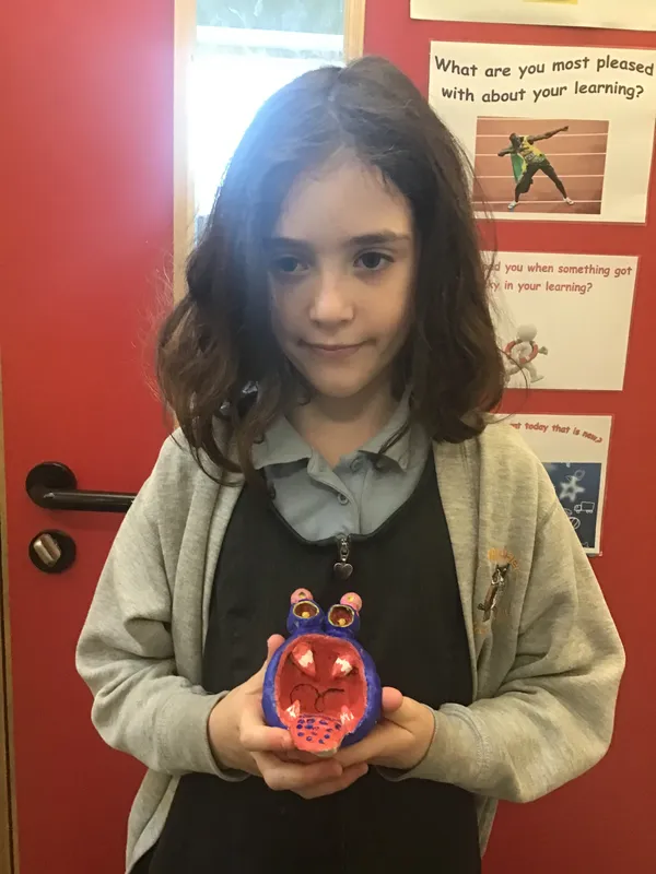
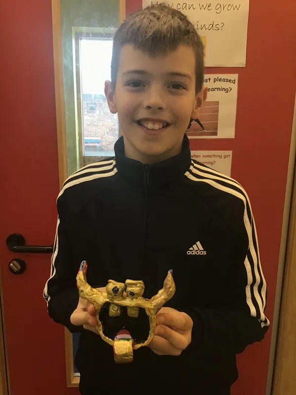
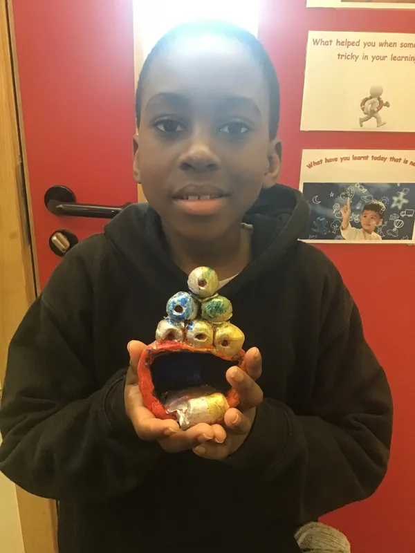
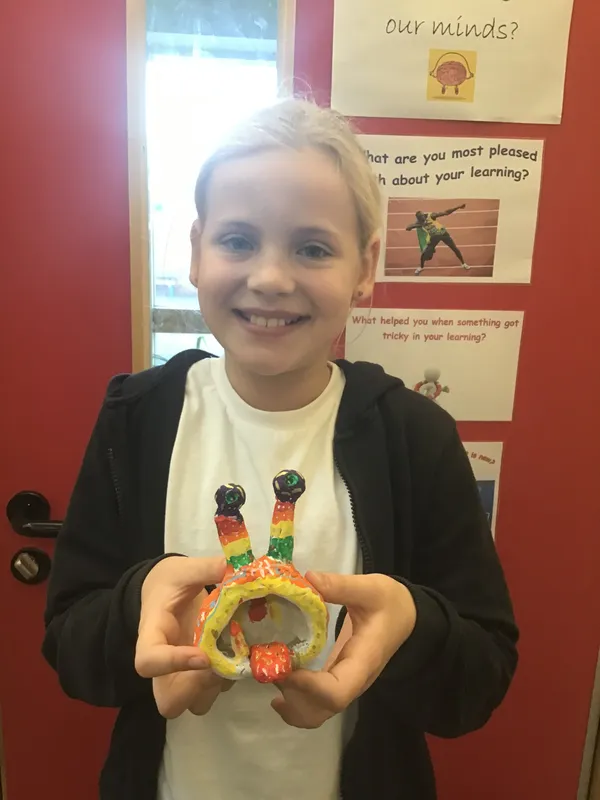
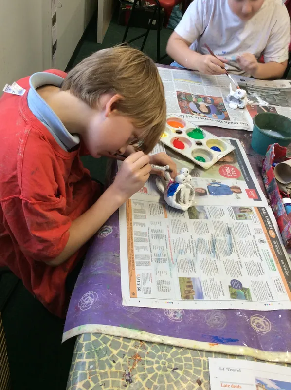
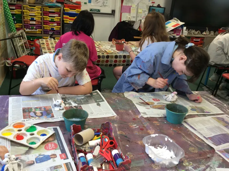
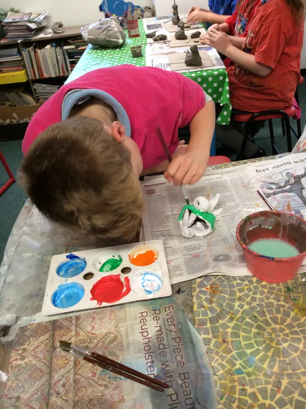
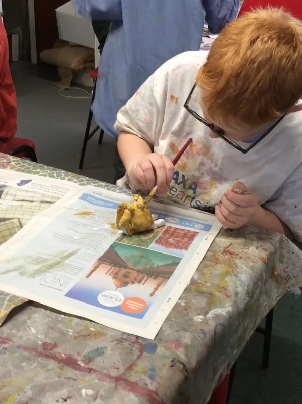
As part of our space topic we investigated the weird and wonderful aliens we could think of. We created preliminary sketches, and chose our favourite to make in 3D out of clay. We learnt how to manipulate the clay and join pieces using the 5 rules - score, score, slip, wiggle, smooth. Luckily, we did a good job with this and most of our pieces stayed attached once dry. Our pieces were decorated with acrylic and finally Posca pens.
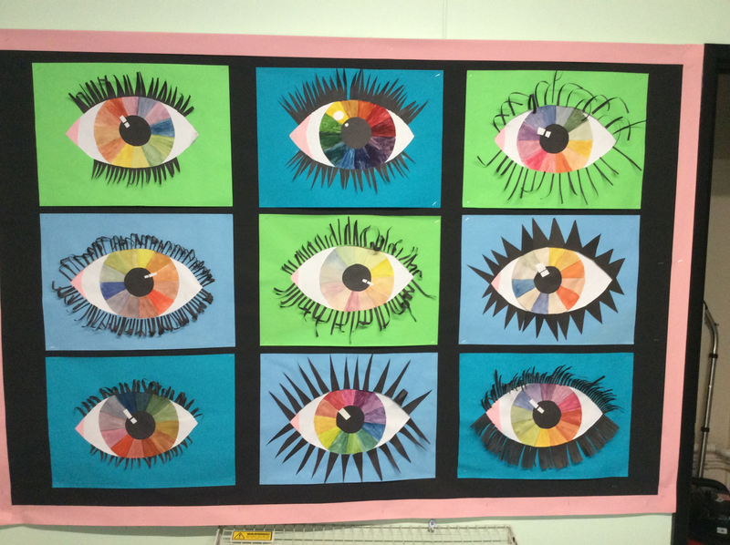
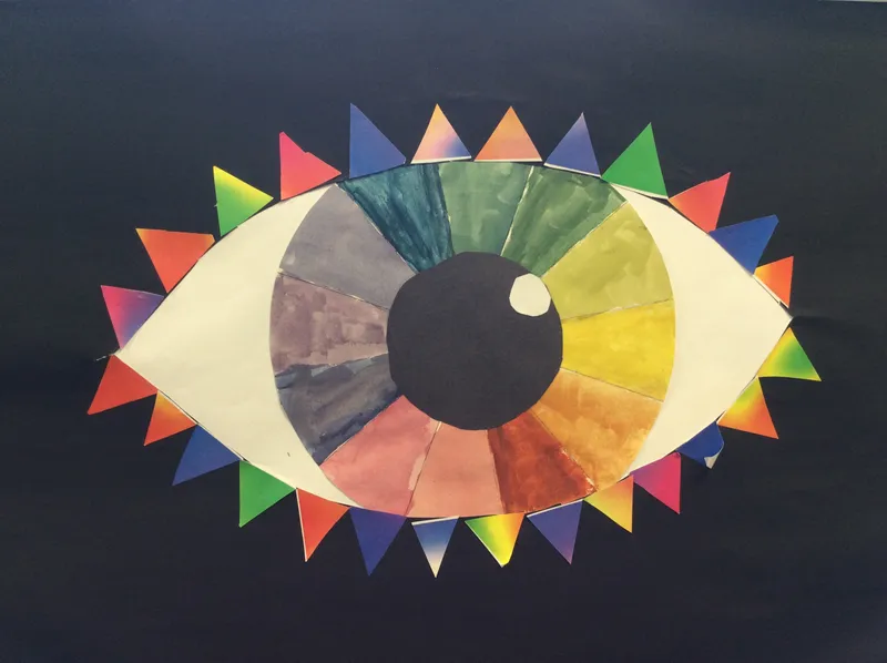
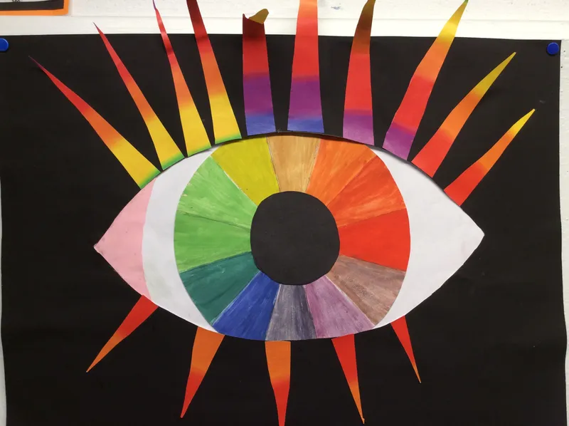
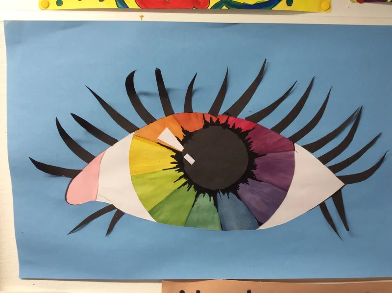
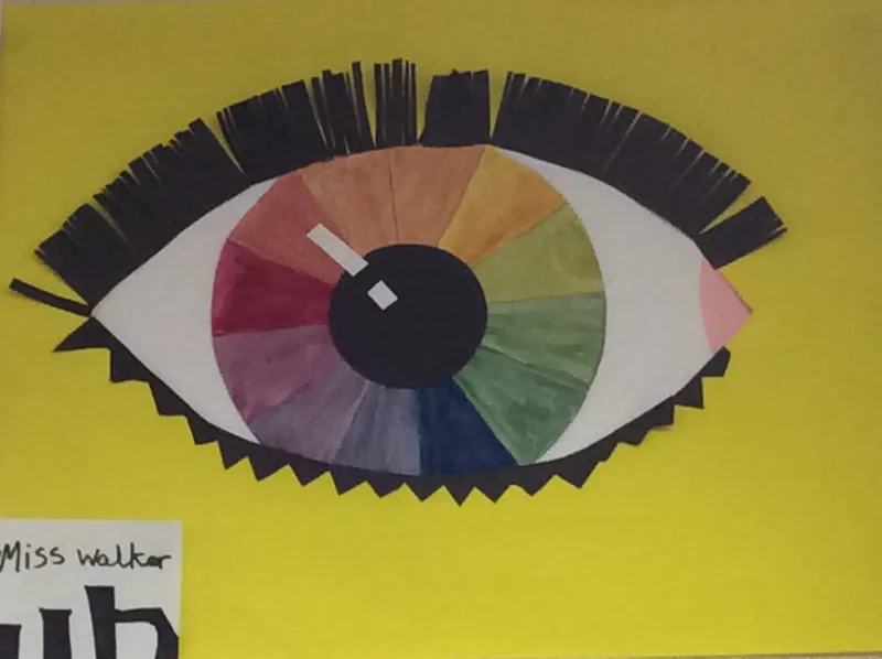
Year 6 Eyes
We studied the colour wheel, looking at making the primary, secondary and tertiary colours with smooth, careful brush strokes. These we them used to create these stunning collage eyes.
Year 6: Artist Study
Creating our own digital portraits, in the style of Julian Opie, is one of the projects we all look forward to. The key to making them look realistic is faithfully outlining the face and hair, plus (strangely) adding the chin line! Click on the pictures - can you see those chin lines? This year some of us wanted to explore the backgrounds a bit more and add details, rather than use a flat colour like Julian Opie.
These portraits will be included in our Year 6 Yearbooks.
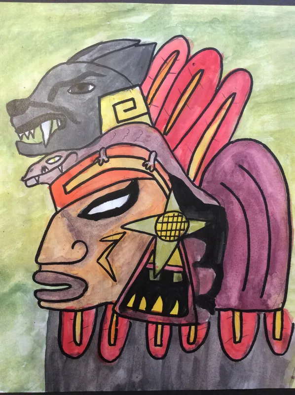
Year 6: Mayans
We studied the glyphs and ceremonial headdresses of the Ancient Mayans. Looking at fierce (and some not so fierce) animals from the South American rain-forests we incorporated them into our headdress design. These were then painted using powder paints displaying our colour mixing skills.
Year 5: Tints and Shades
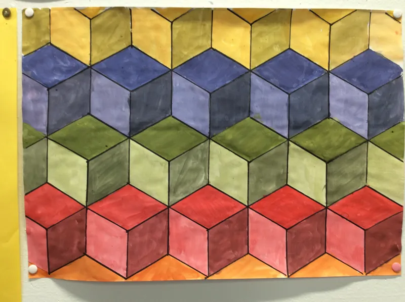
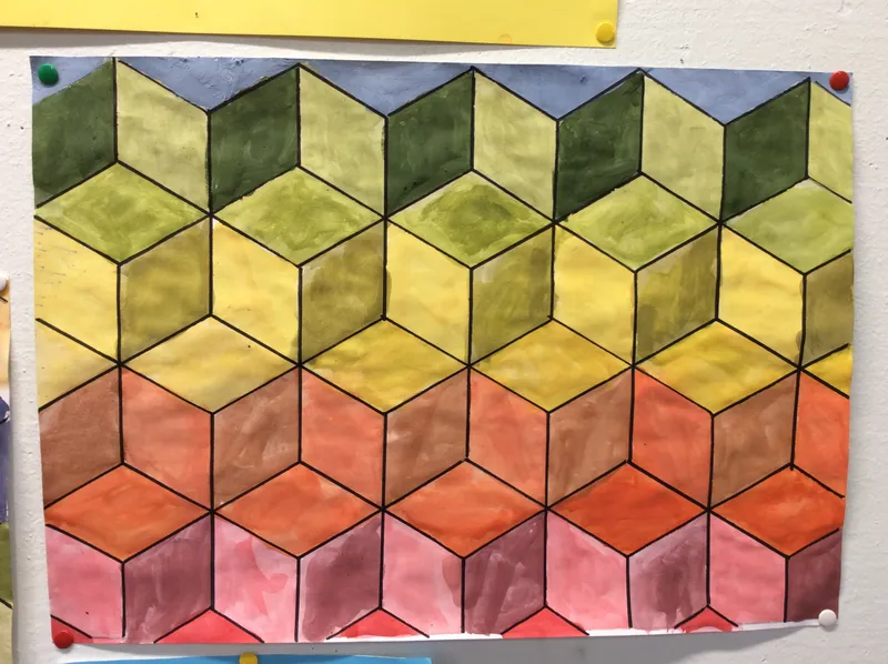
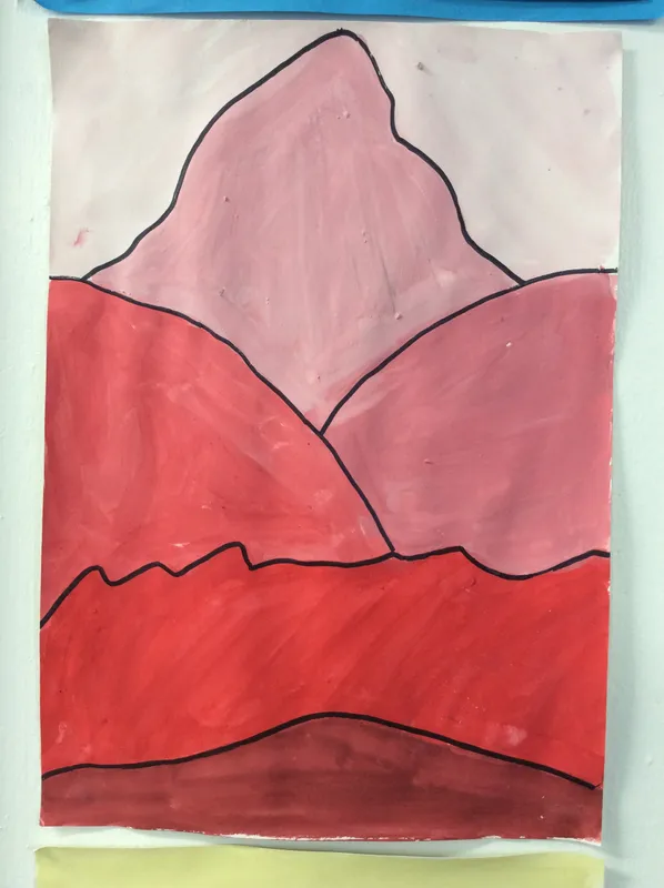
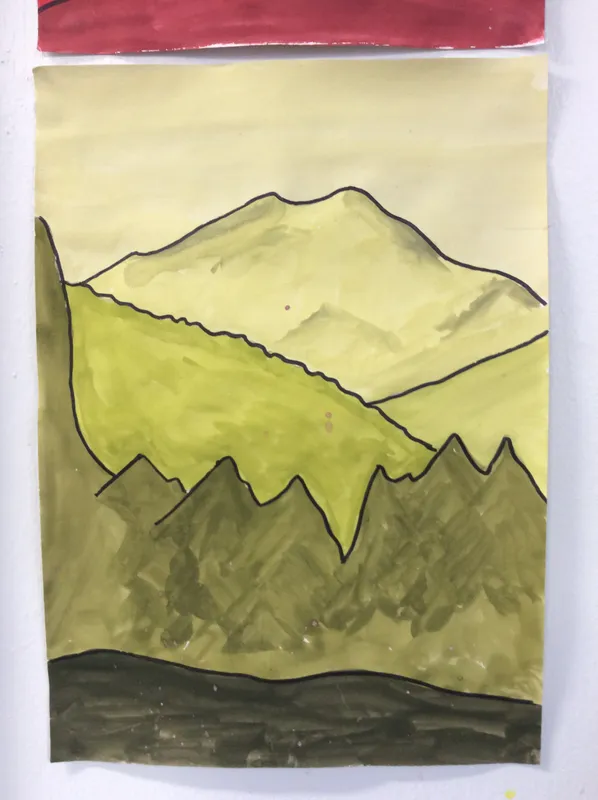
We explored the medium of powder paint and used them to create tints and shades. Once we were confident with the medium we used our skills to create landscapes (showing fore-ground, mid-ground and background layers) and a visual illusion cube composition.
Year 6: L. S. Lowry
As part of a topic based on the Victorians we looked at the industrial landscapes created by famous British artist L. S. Lowry. His work inspired our city collages, which included muted colours and focused on perspective.
Year 5: Artists Study
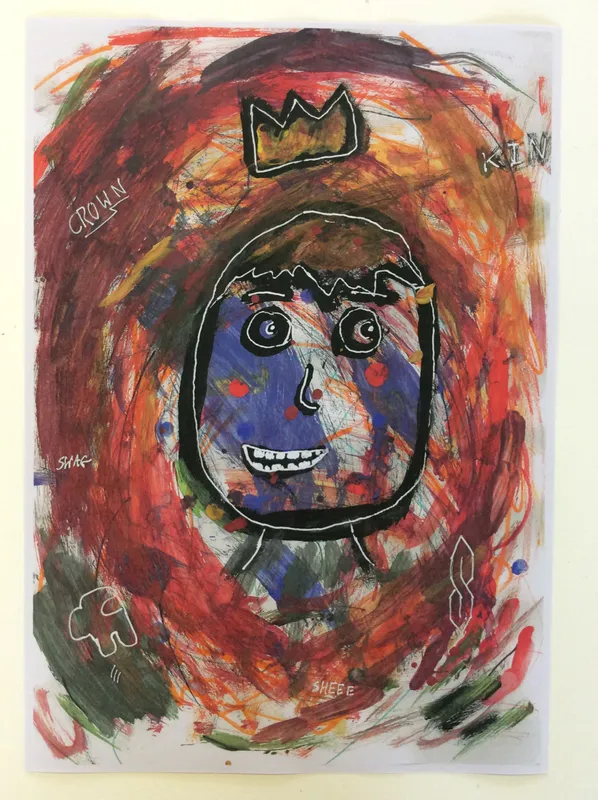
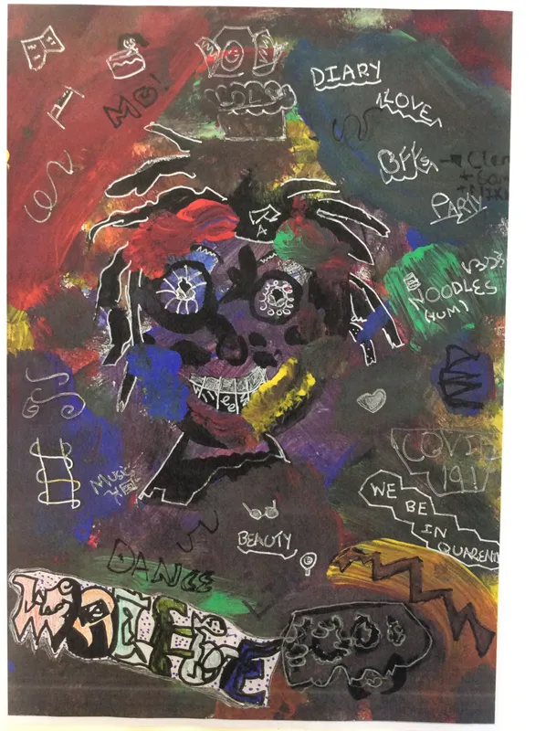
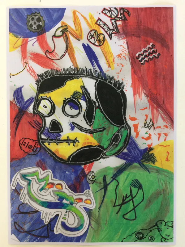
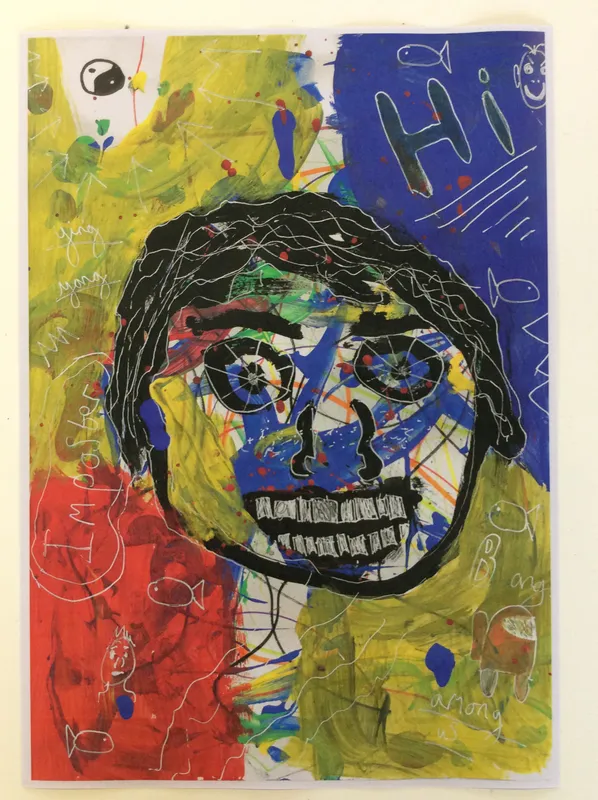
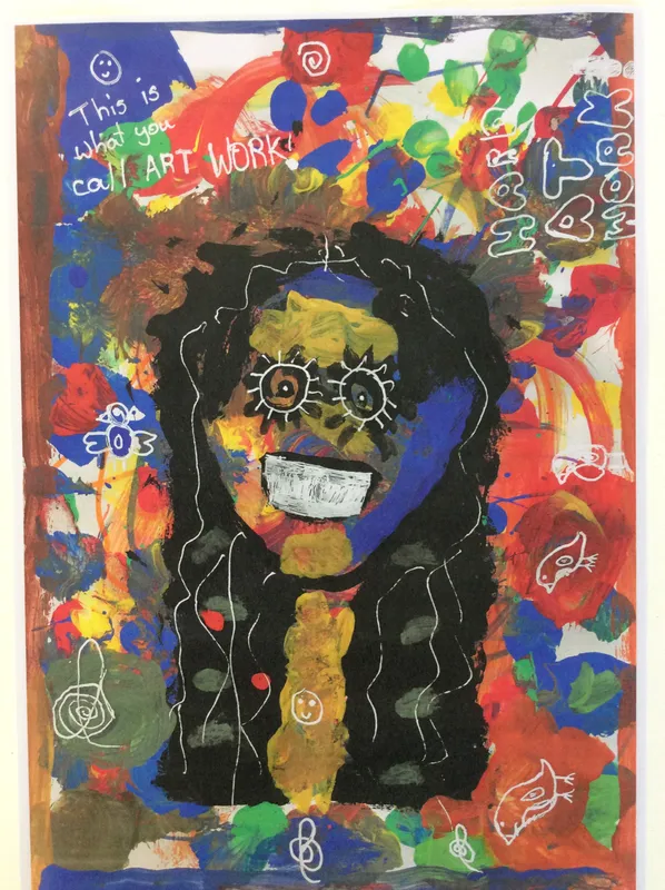
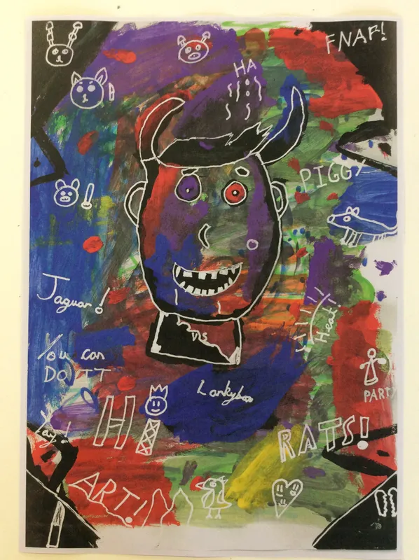
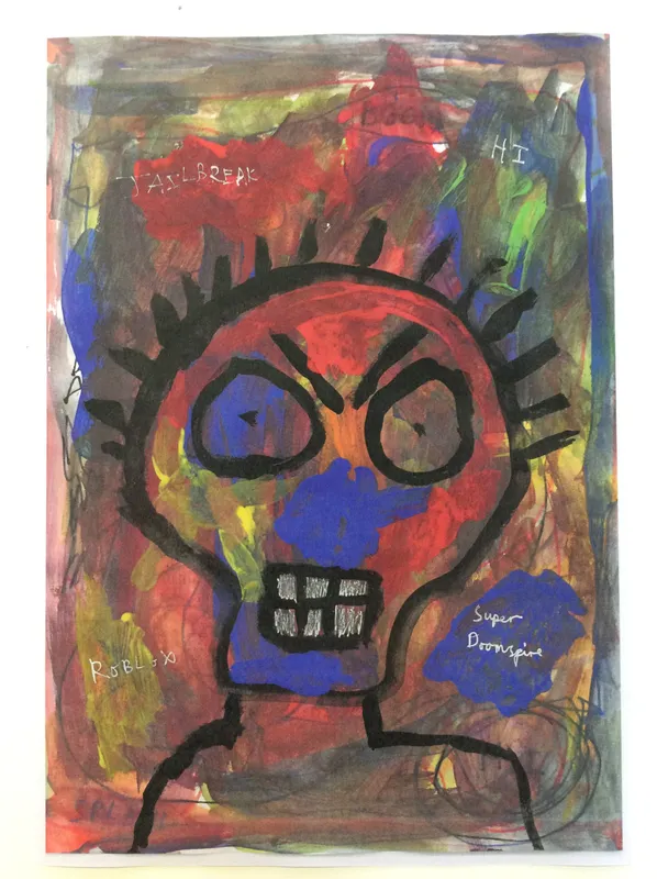
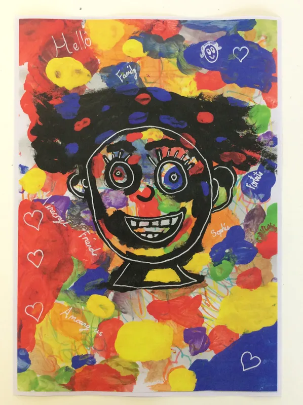
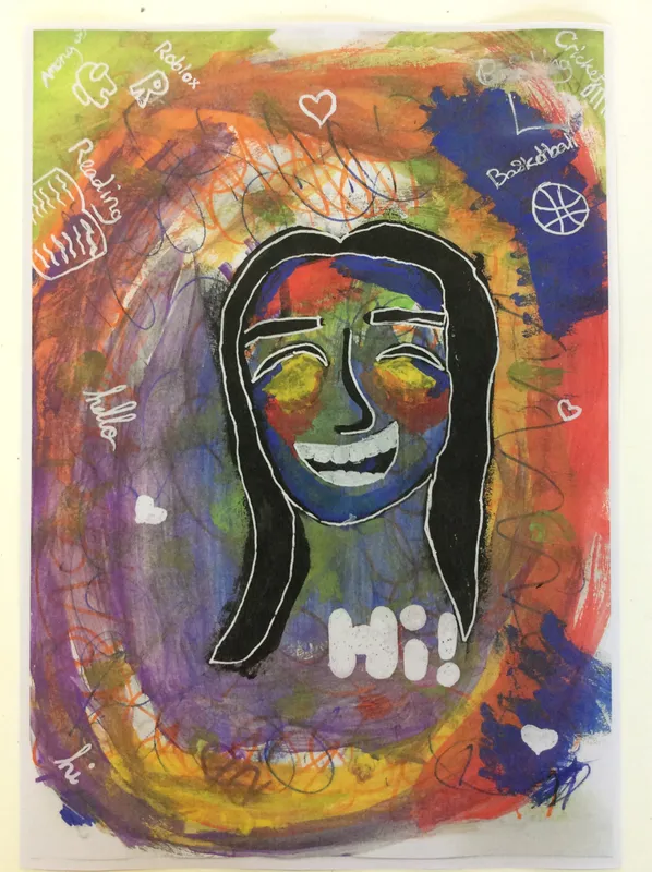
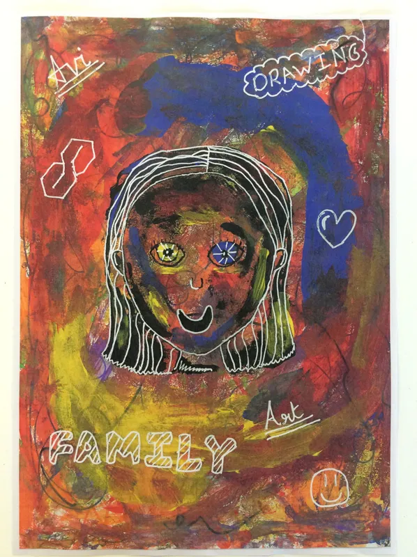
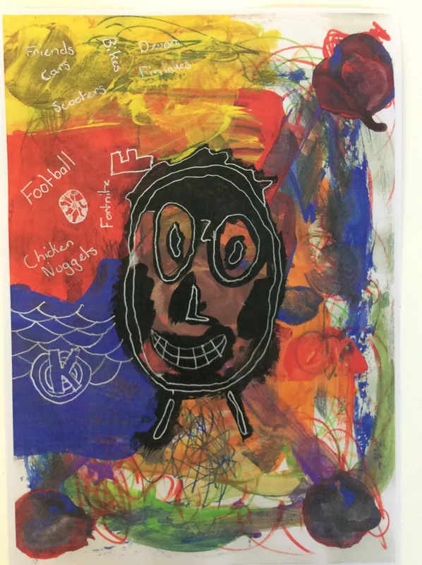
As part of our Crime and Punishment topic we looked at graffiti and street art - the differences between them and the legality of them. We looked in particular at the artist Jean Michel Basquiat and how his style developed from graffiti art. We explored how he used stylised, primitive-looking faces with backgrounds full of colourful imagery and phrases. Both the text and images on his work mean something to him and we did the same - adding our own words and images to our compositions.